
SHarp Tax & Accounting
Role: Lead Designer
Client: Richard Sharp
Scope: Logo Design
I had the pleasure of connecting with Richard Sharp, a local and state tax manager in Minnesota, to create a logo for his tax and accounting services. In our discussions, we agreed that the logo and branding should communicate a sharpness and intelligence, while also being professional and fun.
Challenge:
Construct a logo in 6 weeks to be used for Richard’s tax and accounting services. This includes an initial meeting, 2 revisions, and final deliverables. The logo should communicate sharpness, but should also be professional and fun.
Mission Statement: To provide transparent, reliable, and expert tax and accounting services that empower businesses and individuals to thrive.
Solution:
I designed a structured, modern, professional, but also playful new logo in the time period given. When thinking of taxes and accounting, one would want to work with a business that ensures professionalism and reliable customer service. This final logo design communicates the modern, intelligent, structured, and fun message that a reliable service like Sharp Tax & Accounting provides and represents.

Logo DESIGN Process
SKetches / Explorations
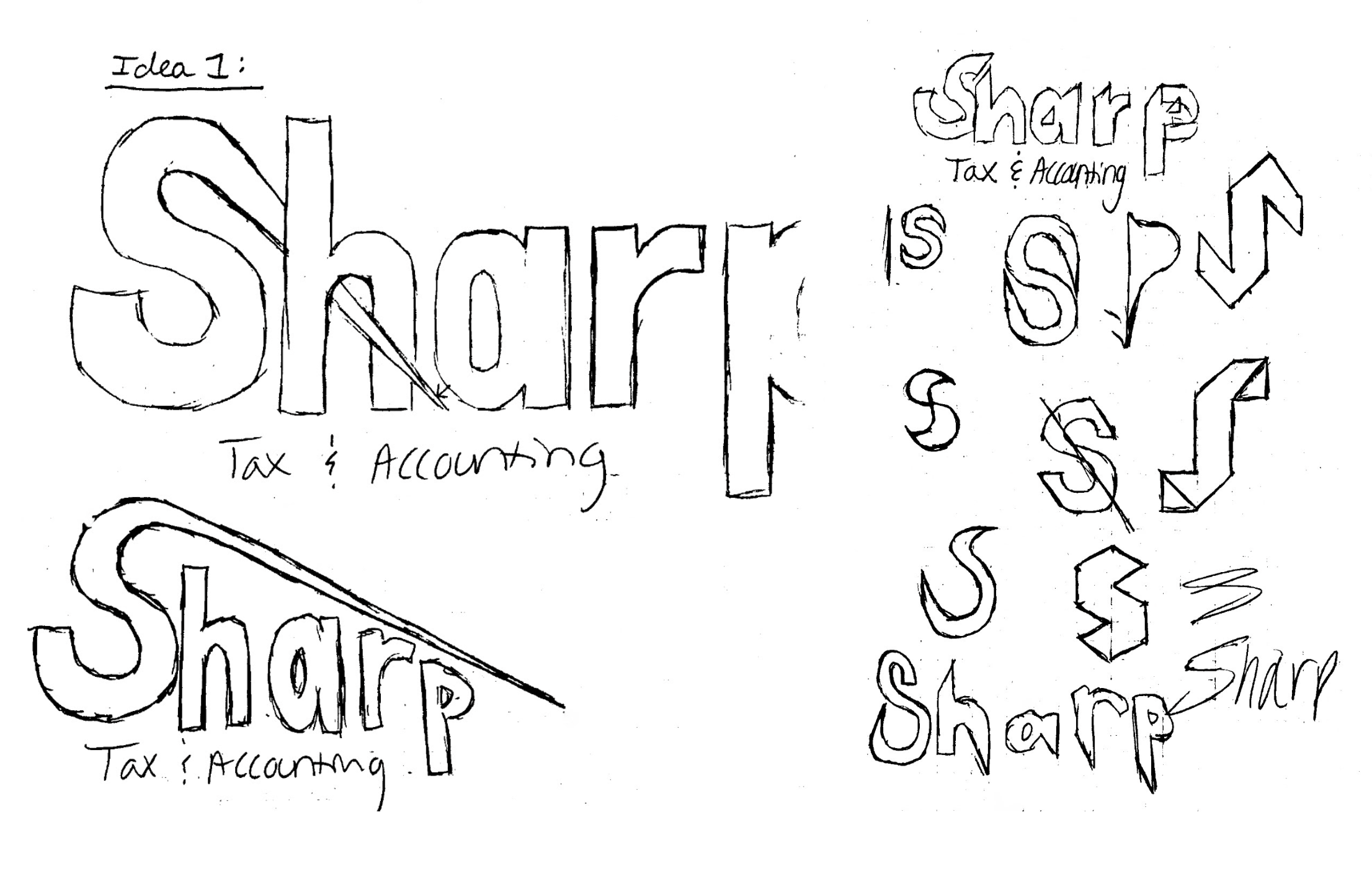
Logo Idea 1
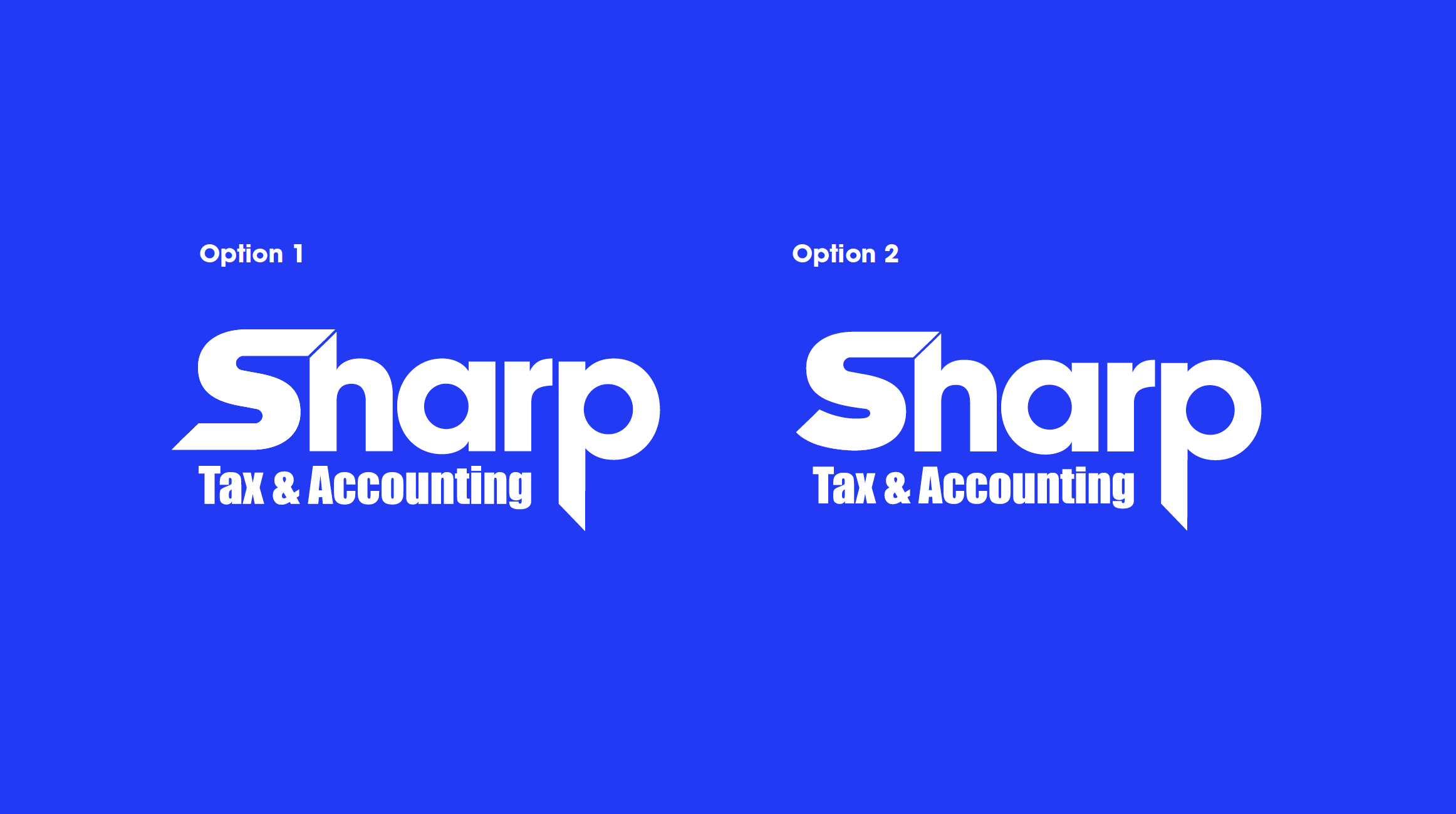
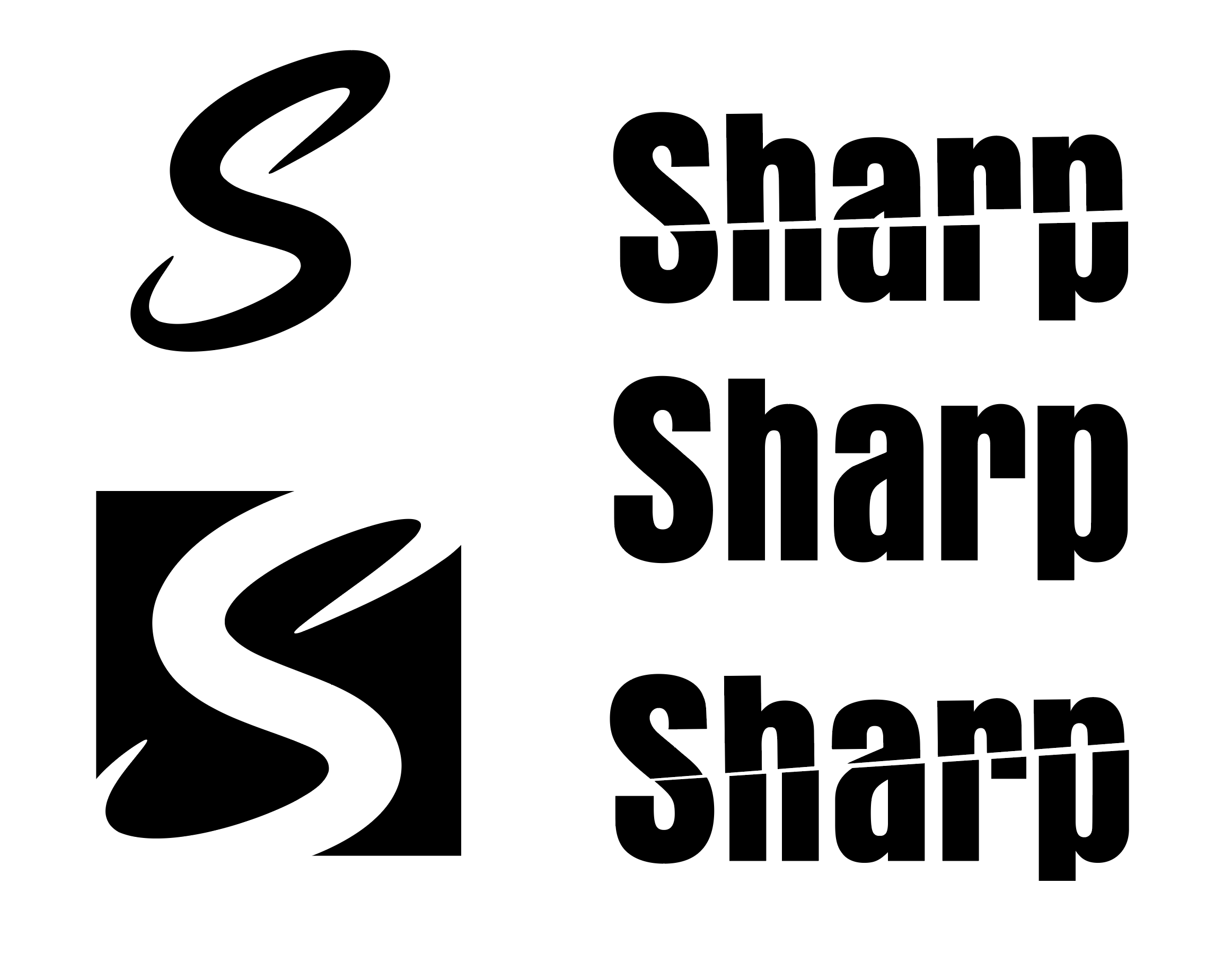
Creating sharp points of contact in the logotype was a goal of mine for this design. I wanted it to create a connection between the S and the H, using the ascender of the H to connect two “sharp” edges. This not only communicates sharpness within the design, but creates a unifying point of contact between the letters that create visual interest and connection.
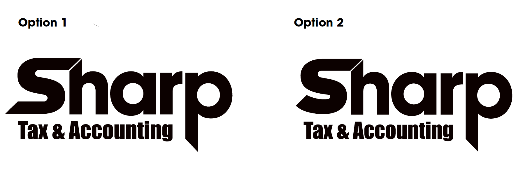
Richard enjoyed the look of the flat terminal of the S on Option 1. It not only creates a more unifying shape and helps frame the subtitle of “Tax & Accounting,” but it also creates a more distinguishable look. We also agreed that the subtitle should be a thinner typeface to help differentiate it from the logotype.
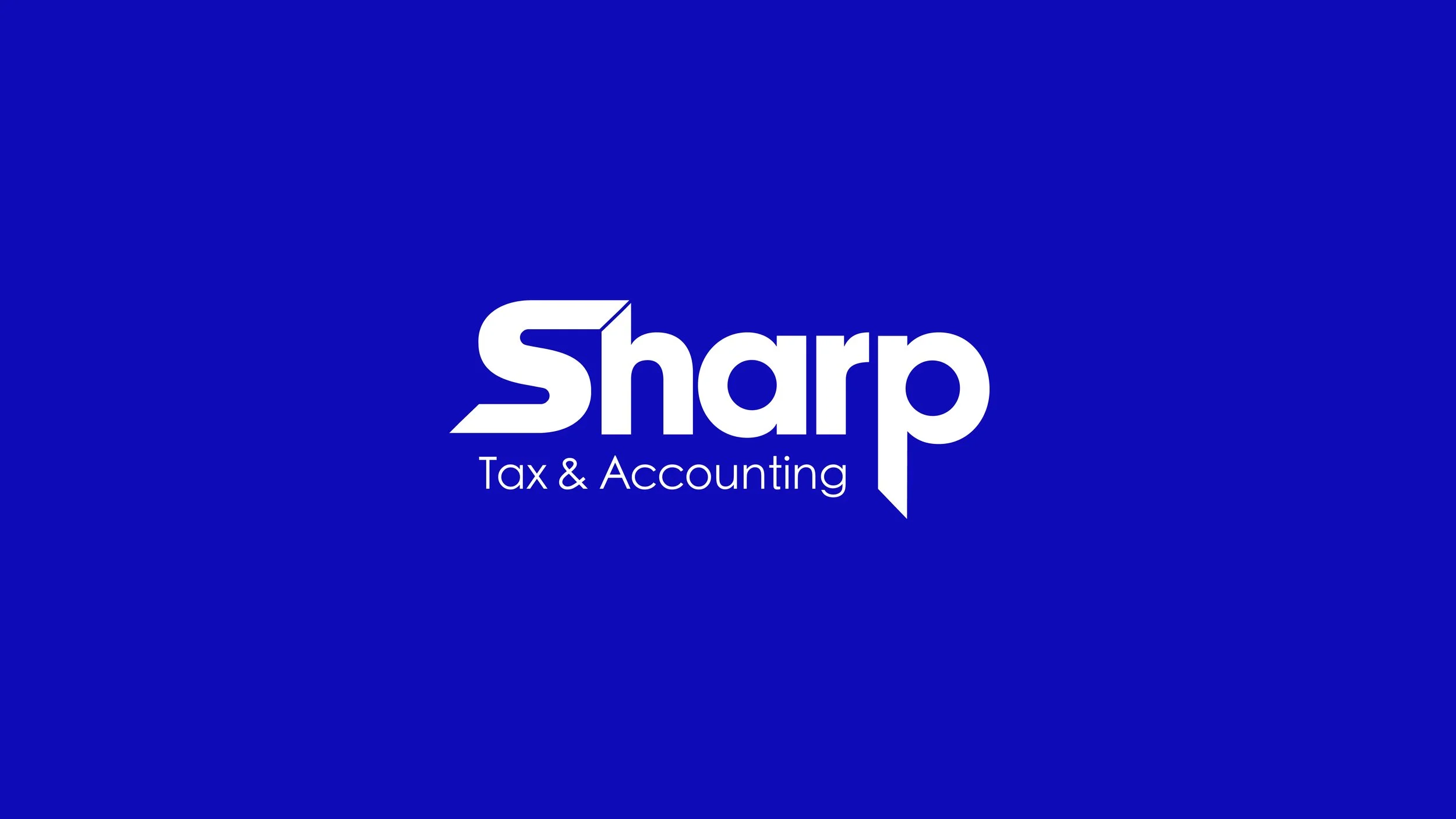
Final Logo Design
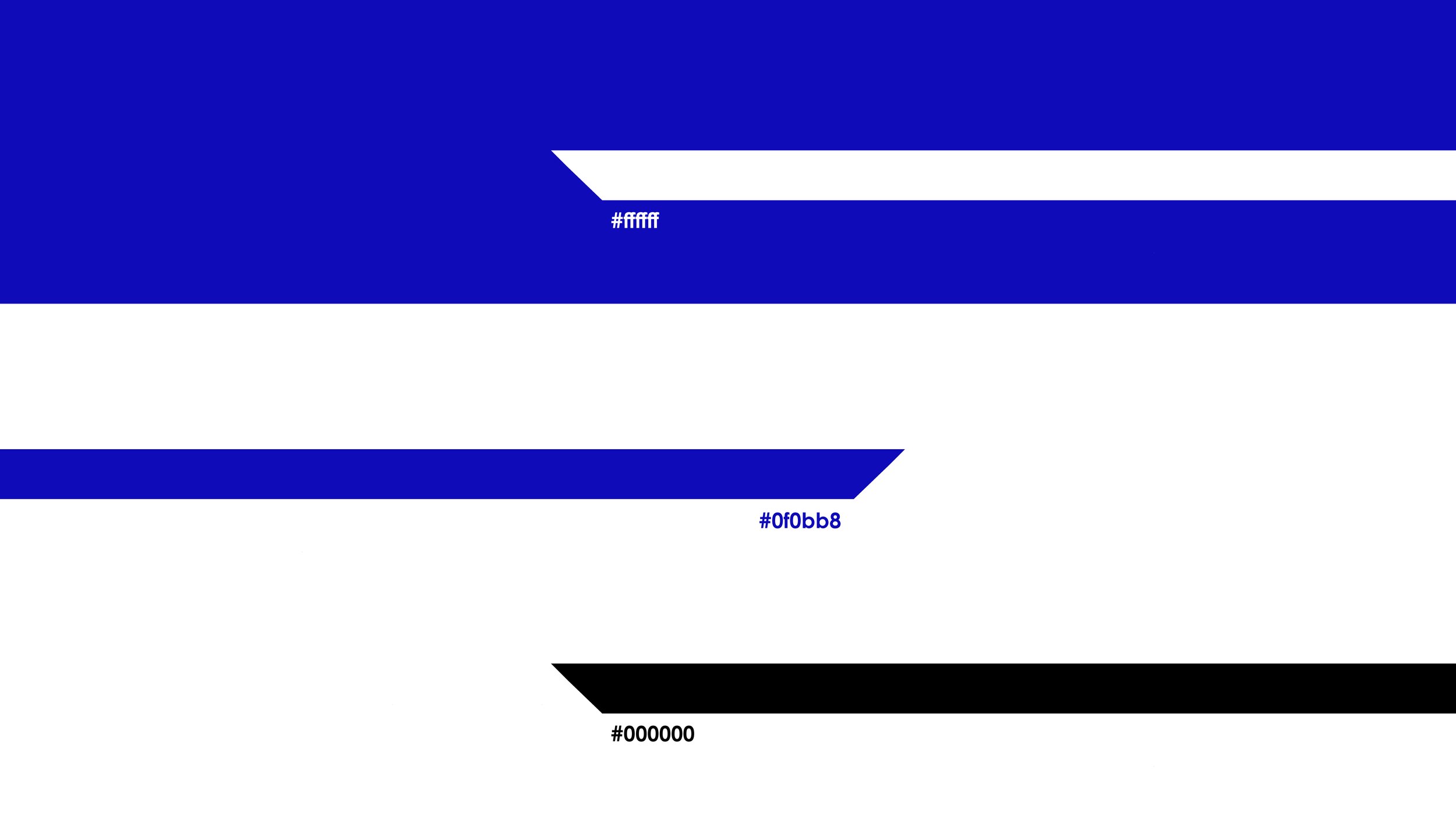
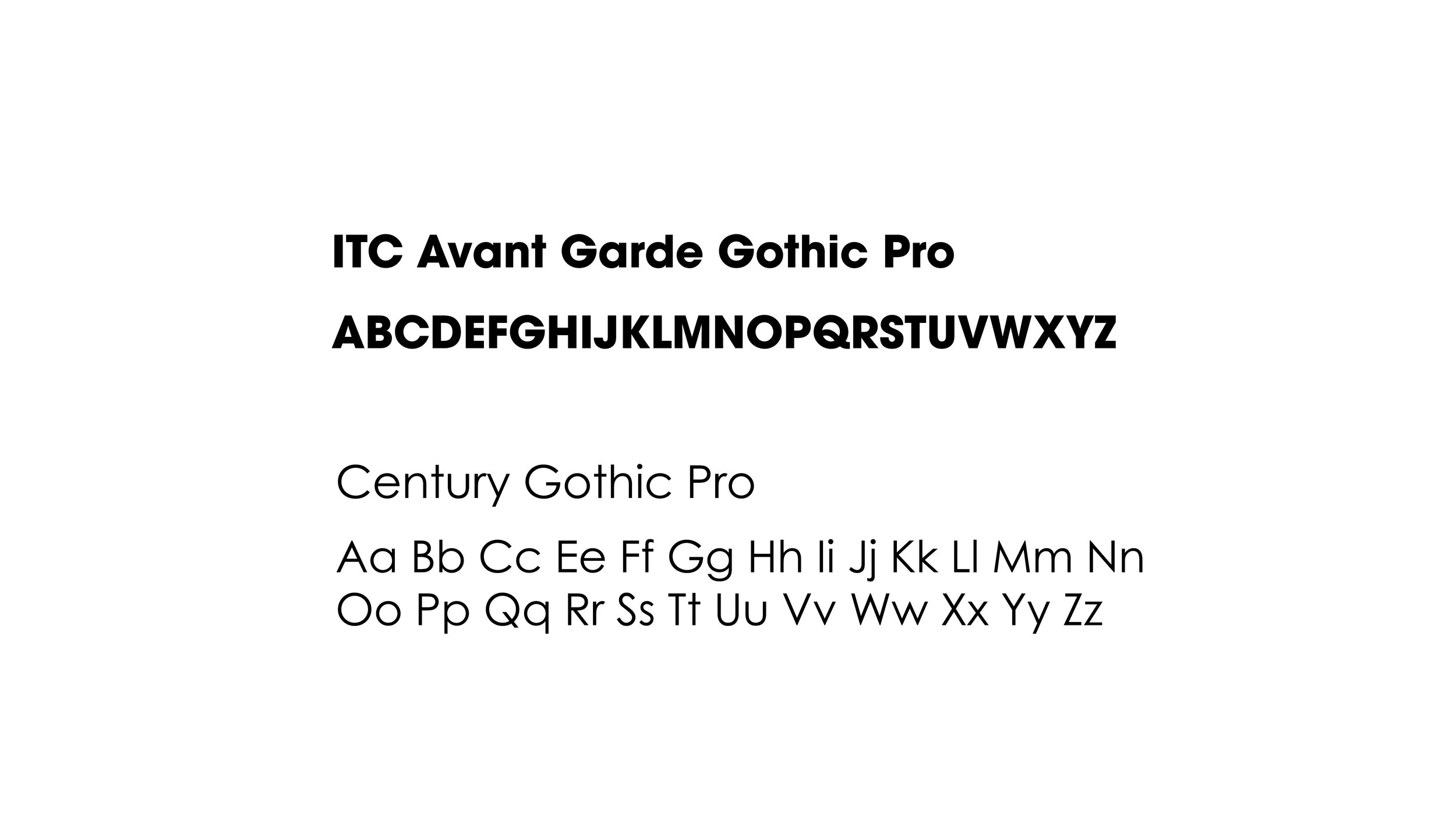
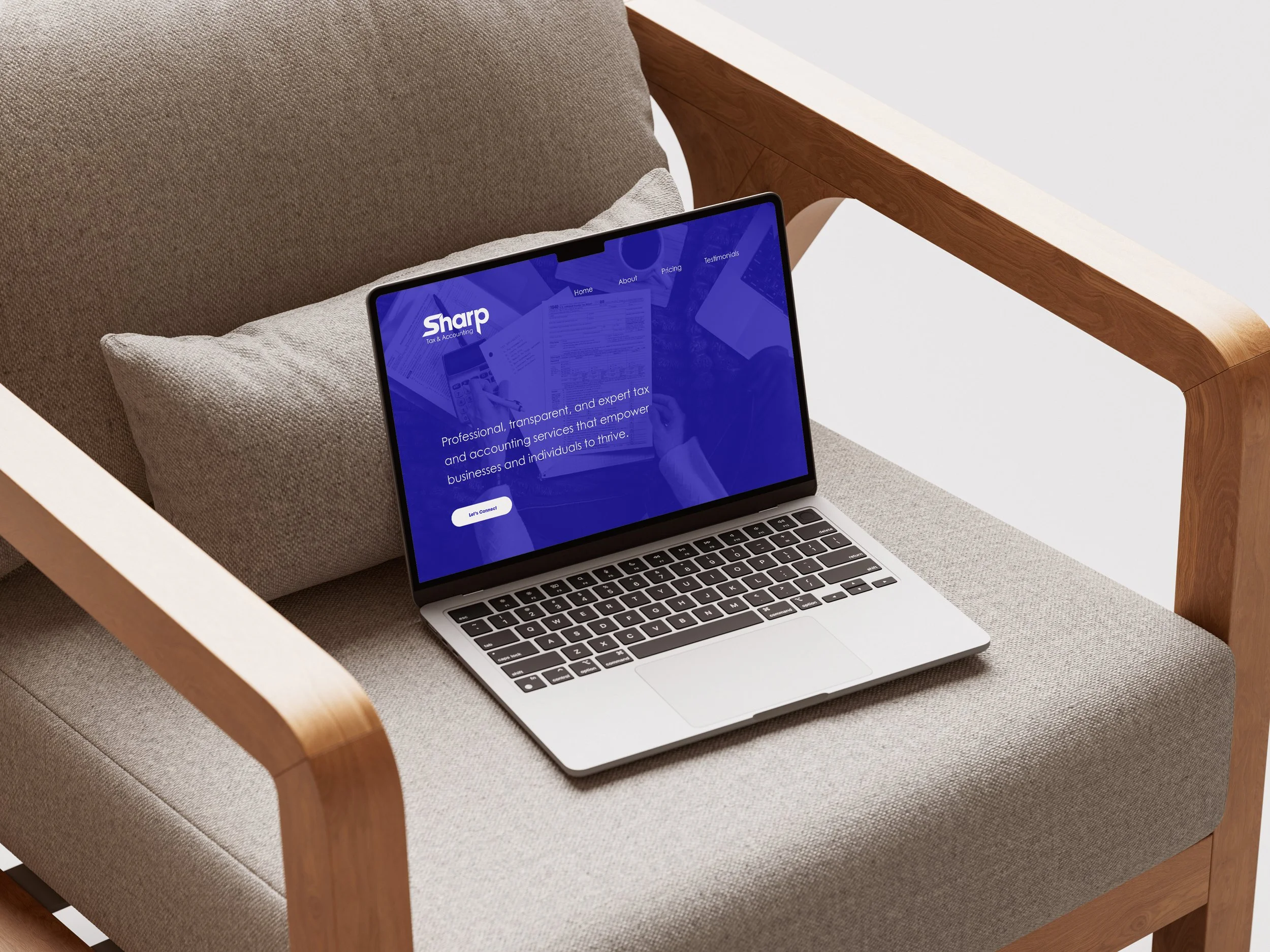
For the final version of the logo, Richard and I agreed that a darker royal blue would be a great fit for the design. I used Century Gothic Pro for the subtitle, which allows for more emphasis on “Sharp” and creates a clearer visual hierarchy for the viewer. I wanted the emphasis on “Sharp” to play into the visual sharpness of the word. This draws the viewer into the playful visual storytelling, leading them to read the “Tax & Accounting” subtitle for a clear message of the services Richard provides.
The logo is simple, sharp, and unified: all things you want your Tax & Accounting service to be.