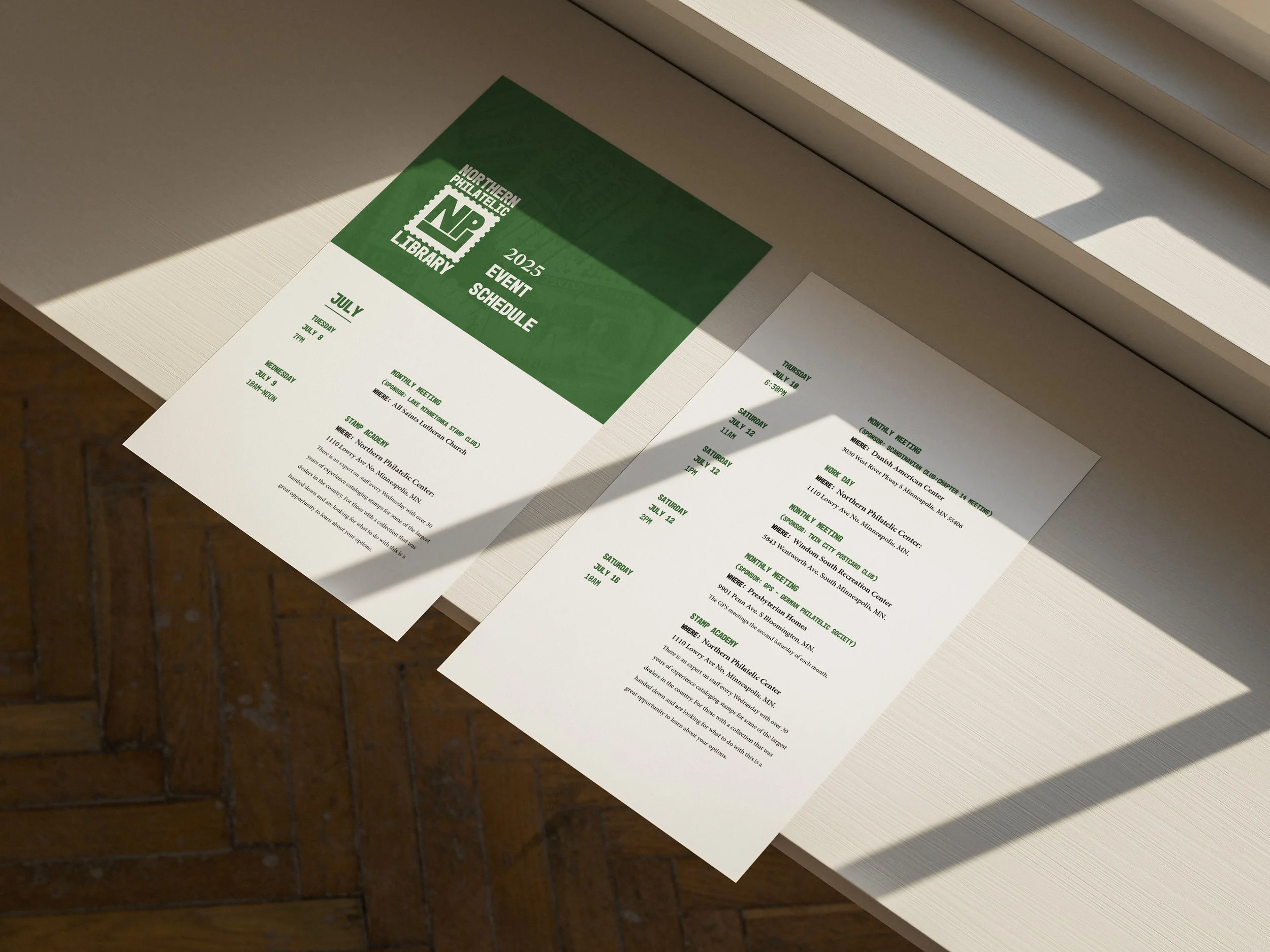
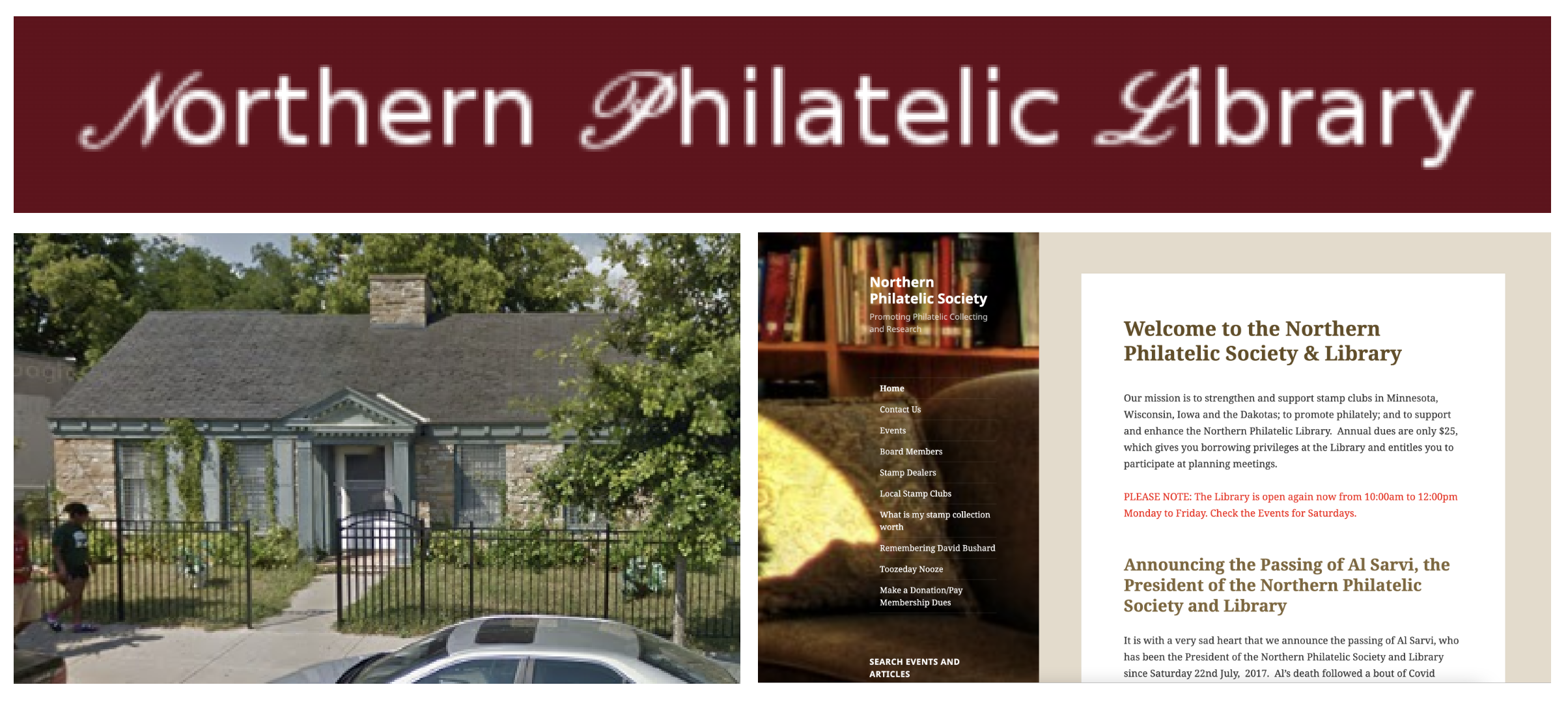
The Northern Philatelic Library
Role: Lead Designer
Client: The Northern Philatelic Library
Scope: Logo Design, Branding
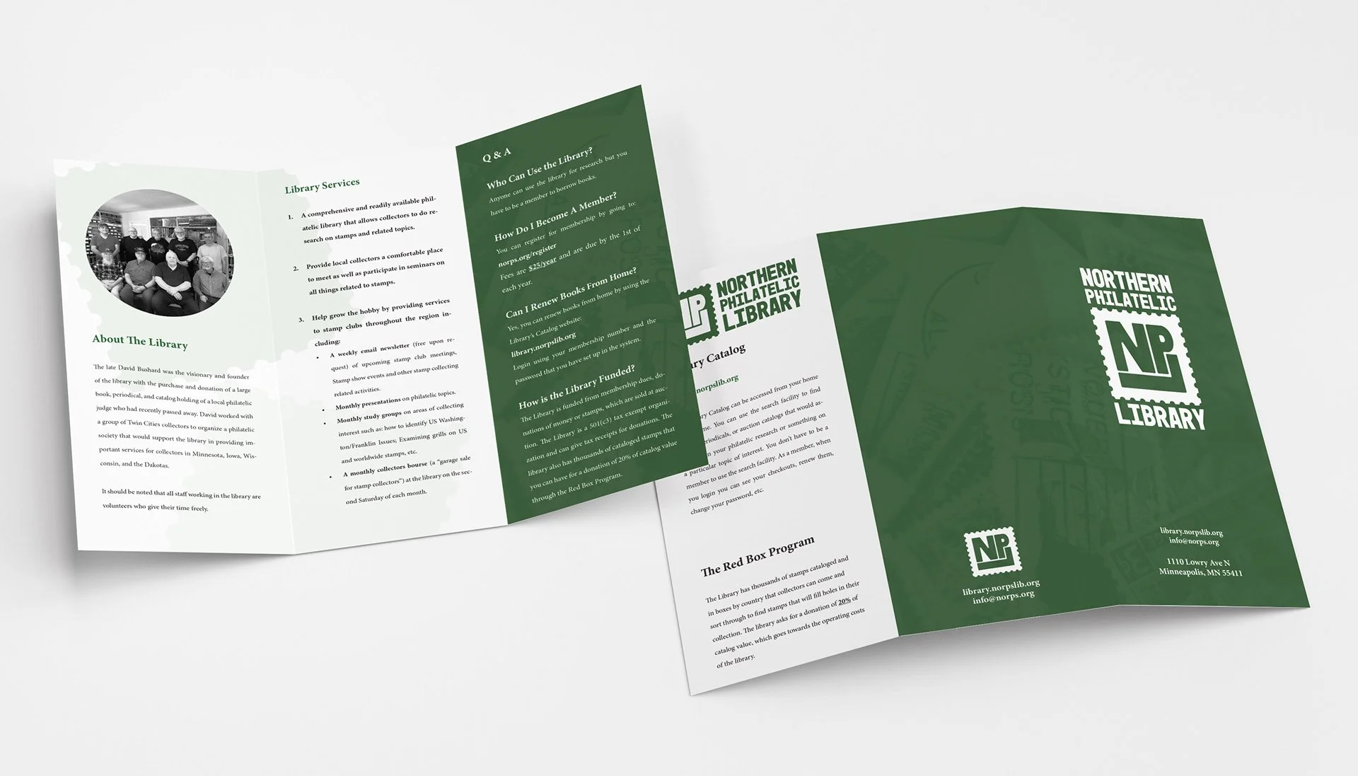
The Northern Philatelic Library is nonprofit library located in Minneapolis, Minnesota that allows stamp collectors to do research on stamps and related topics. They provide local collectors a comfortable place to meet as well as participate in seminars on all things related to stamps. They also help grow the hobby by providing services to stamp clubs throughout the region.
Philatelic is an adjective referring to the collection, study, and appreciation of postage stamps, postmarks, envelopes, and related postal materials. Derived from philately, this field involves examining the history, design, and production of stamps, often as a hobby or investment.
Challenge:
The library wanted a new logo and branding that established their identity in the philatelic community. They wanted people to know that they are more than just a library, but also a social club. Stamp collecting can be seen as a niche and specialized hobby, so creating branding that is approachable and welcoming is vital to getting more people interested in collecting, and partaking in the library’s services and community events.
Solution:
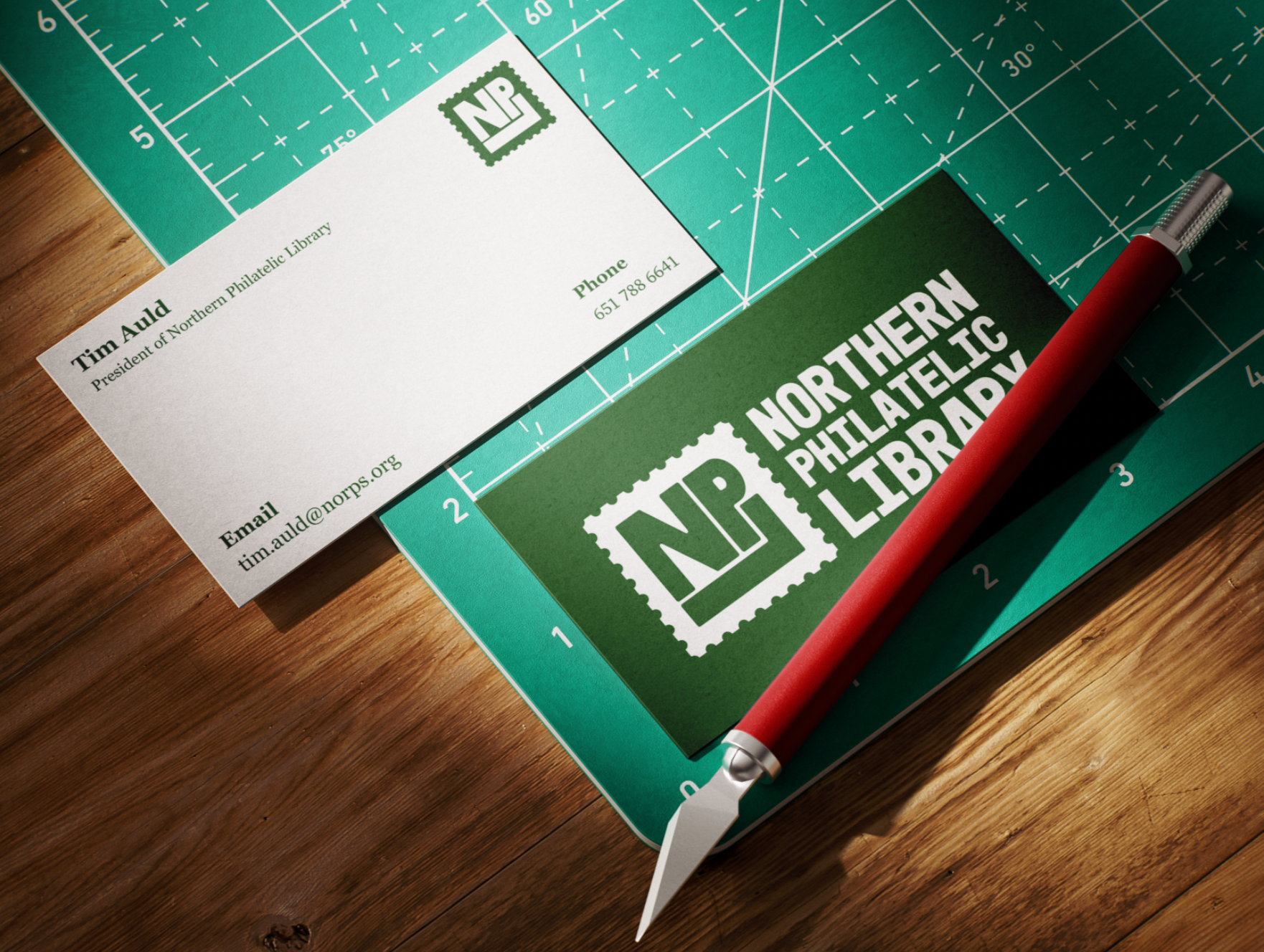
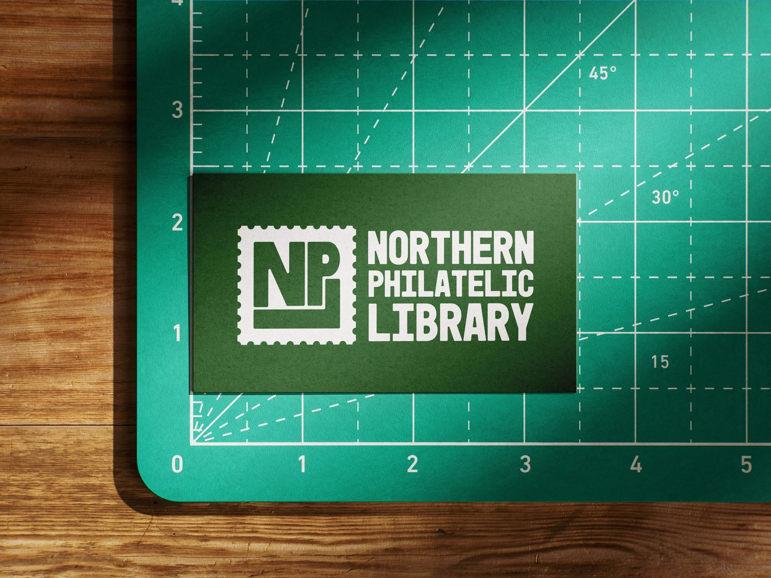
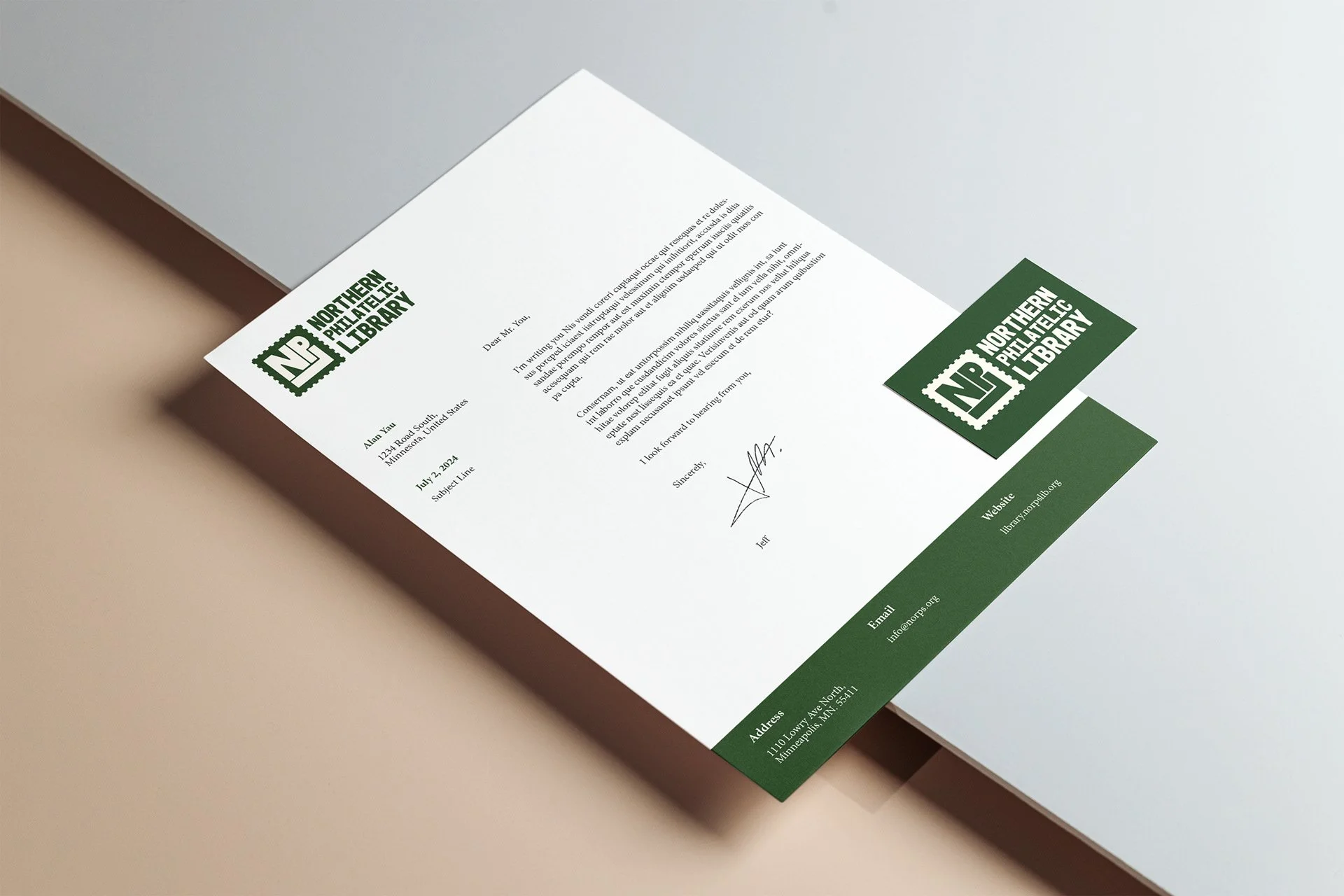
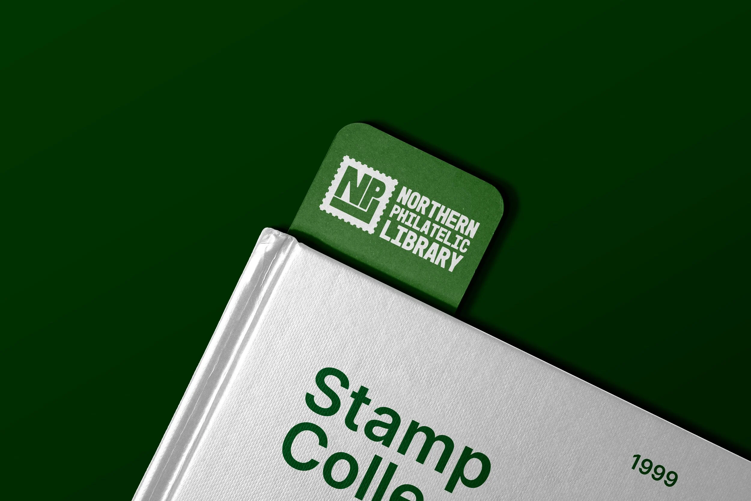
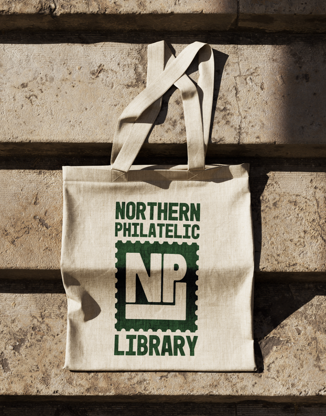
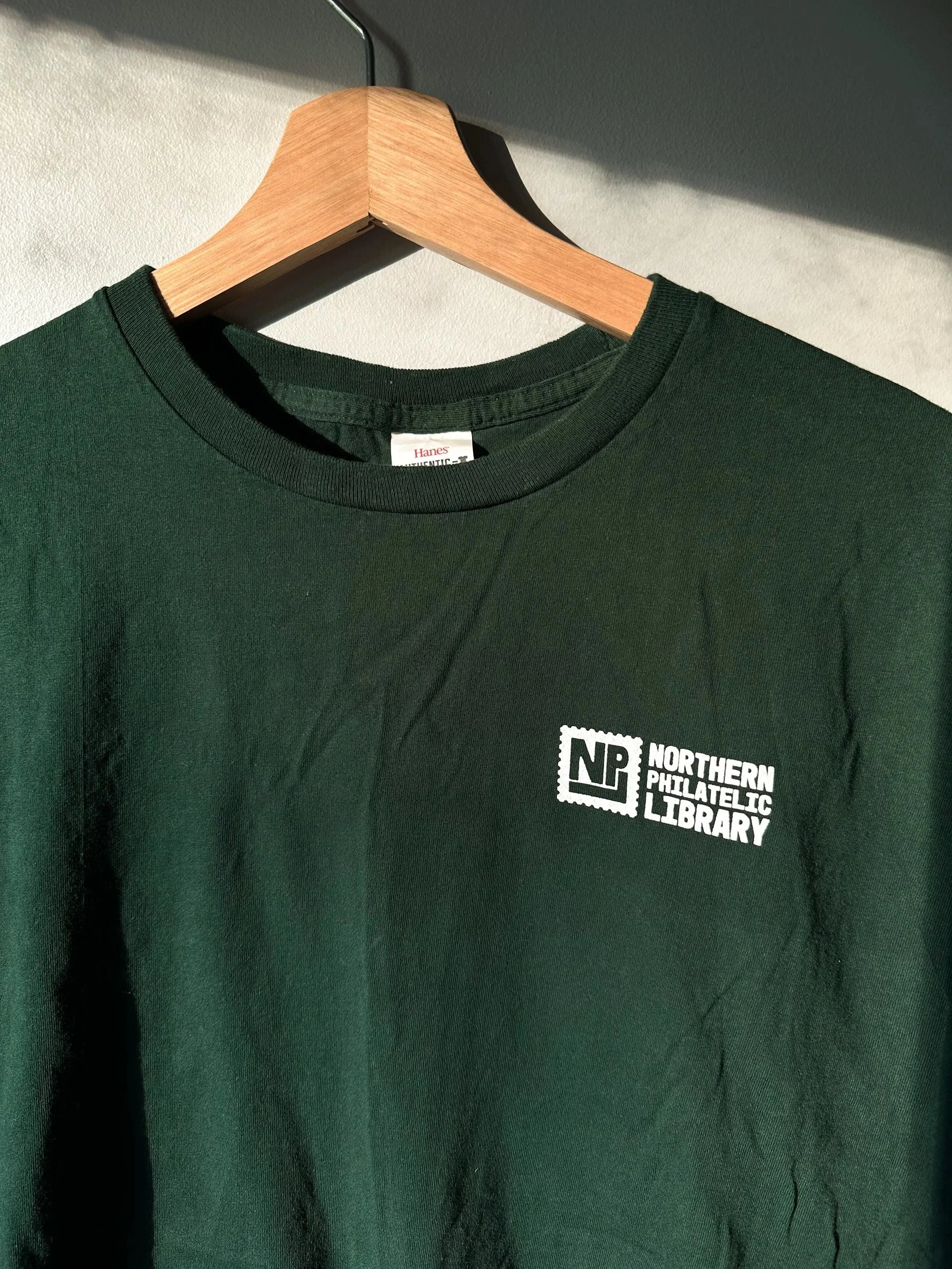
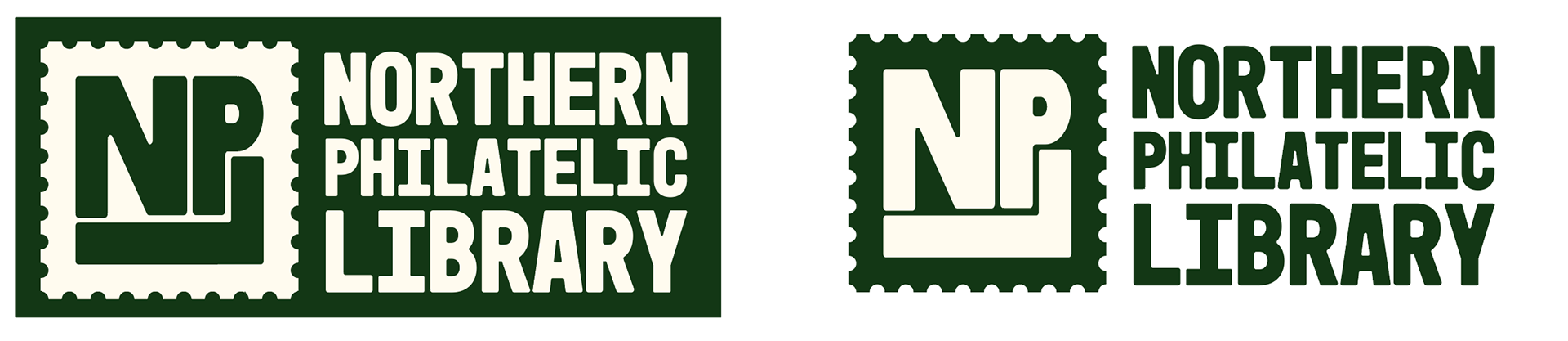
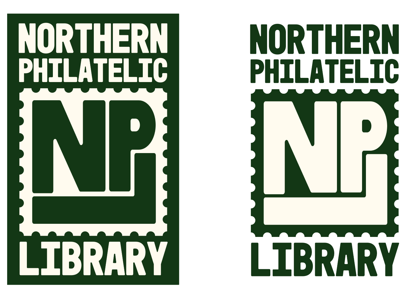
The new logo is professional, approachable, fun, and universal. It sets the library up to be a social club and community for those interested in the philatelic world. It creates a clear and distinguishable visual identity.


Logo Process
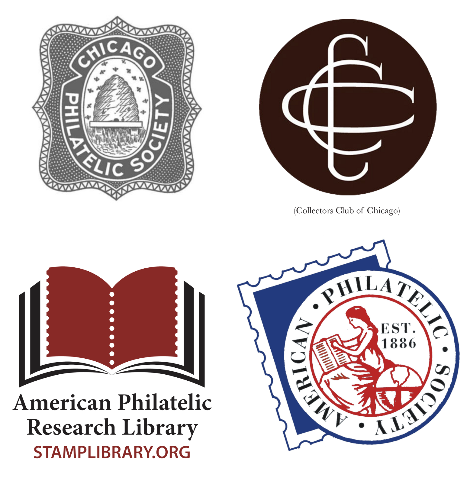
Existing Brand Identity
Logos that exist in the philatelic world
Sketches / Explorations
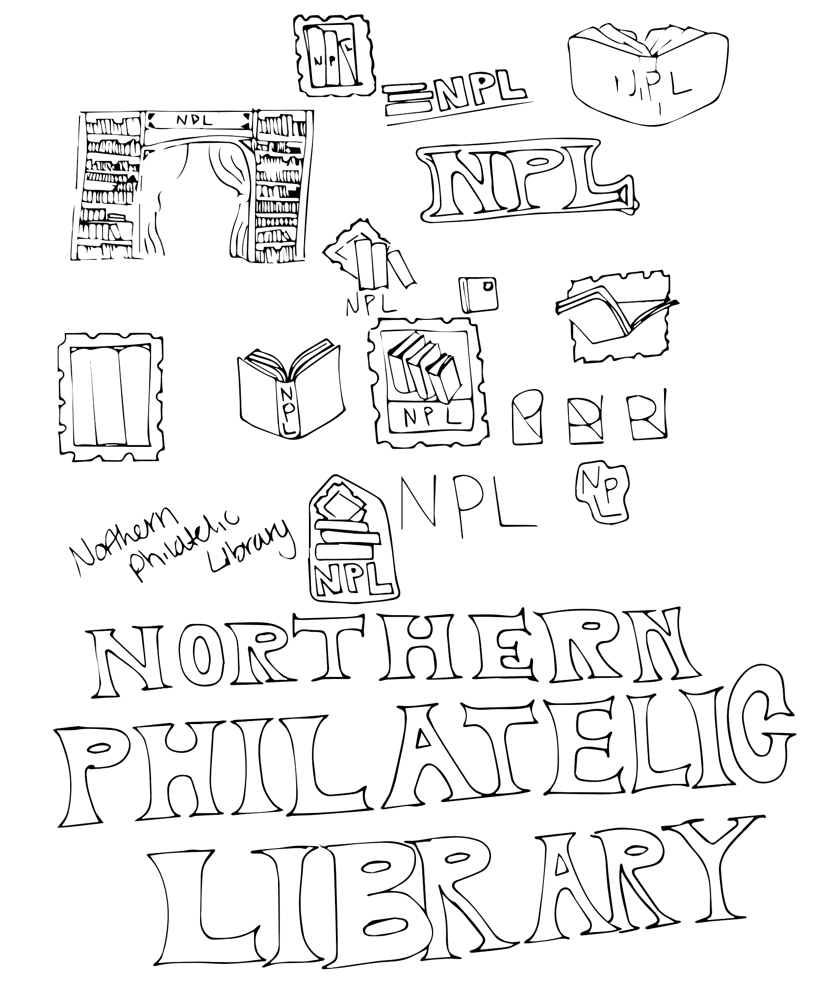
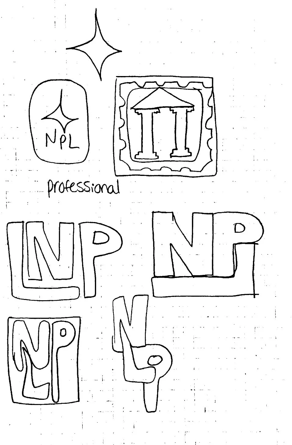
Idea 1
I leaned into the library visuals and liked the idea of the stamp shape framing the illustration. It felt formal, dependable, and classic. The next step was to explore a more playful and approachable logo that was not as tied to the “library” visuals and could be a bit more universal in purpose.
Idea 2
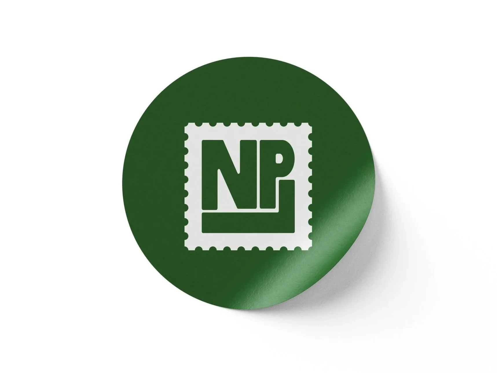
I explored a more playful arrangement of letters to form the body of the stamp. The logo also uses curved edges to play into the friendly and approachable nature of the library. It felt more approachable in the way that it indicates it’s relation to stamps, but universal enough to apply to many philatelic activities or events. It has an identity of its own while also being an umbrella for what the Northern Philatelic Library offers and provides for the community.
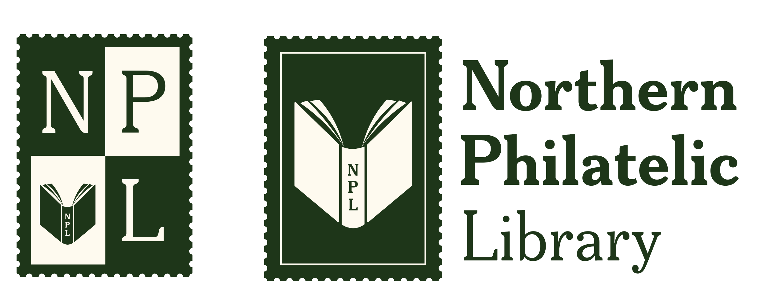
And the library chose… idea 2!
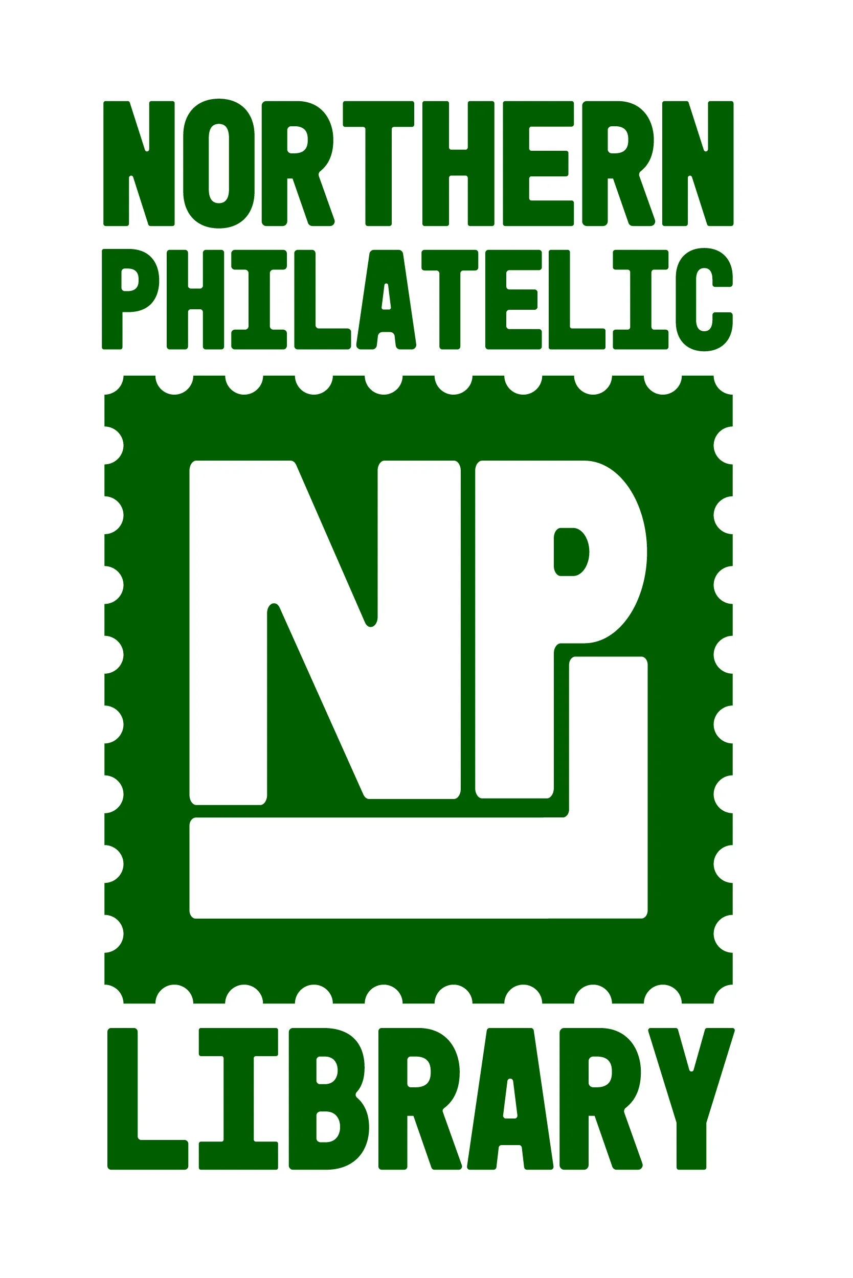
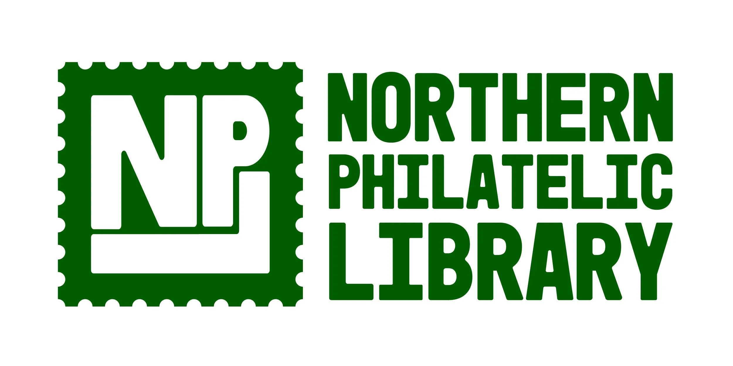
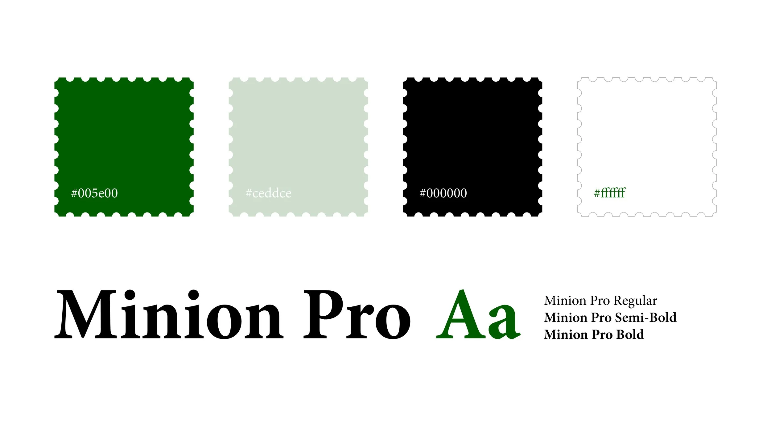
With some adjustments of the colors to a brighter green, the logo was ready! The library enjoyed the playful arrangement of the lettering, and they liked that it could be a universal logo for everything that they do, not just labeling them as a library. It is specific to philately, but ultimate feels and looks like a social club.
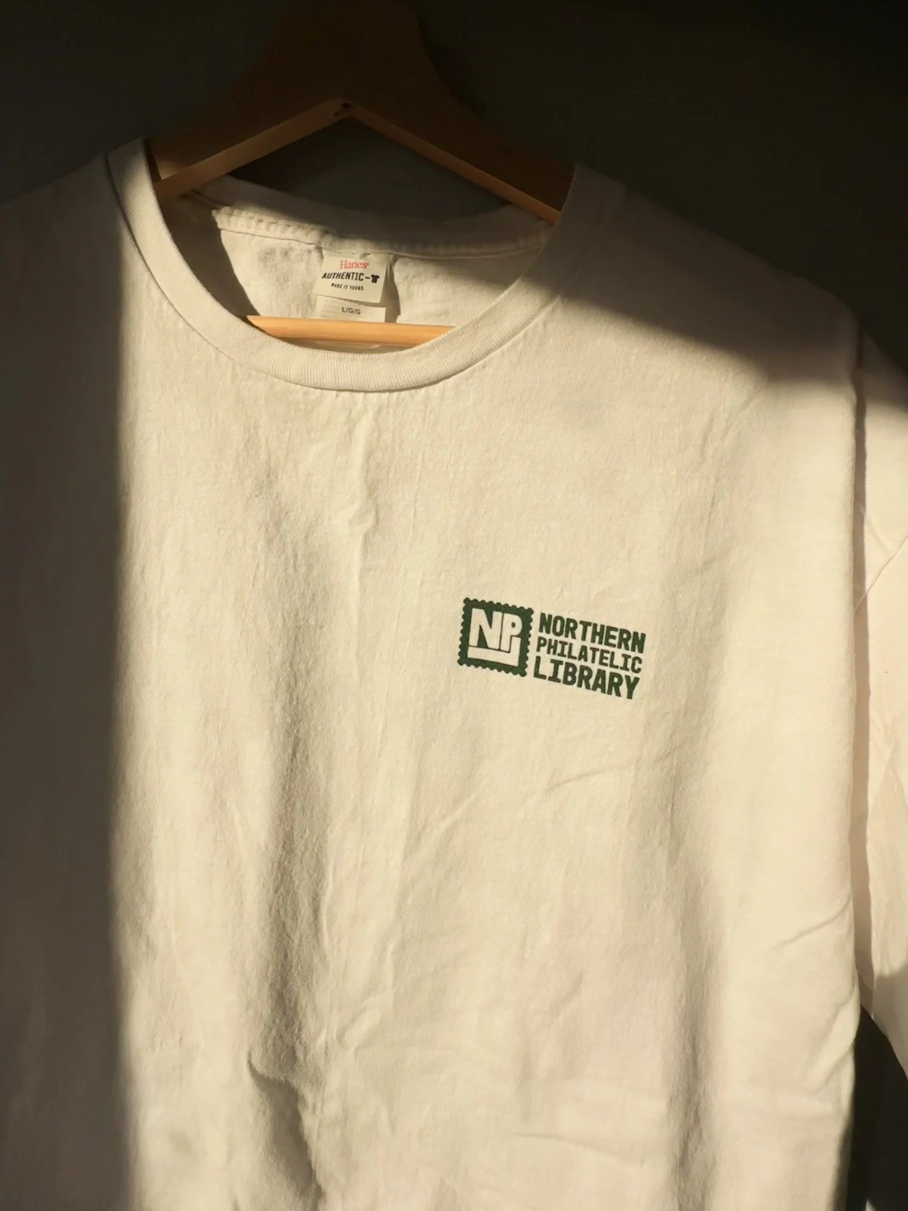
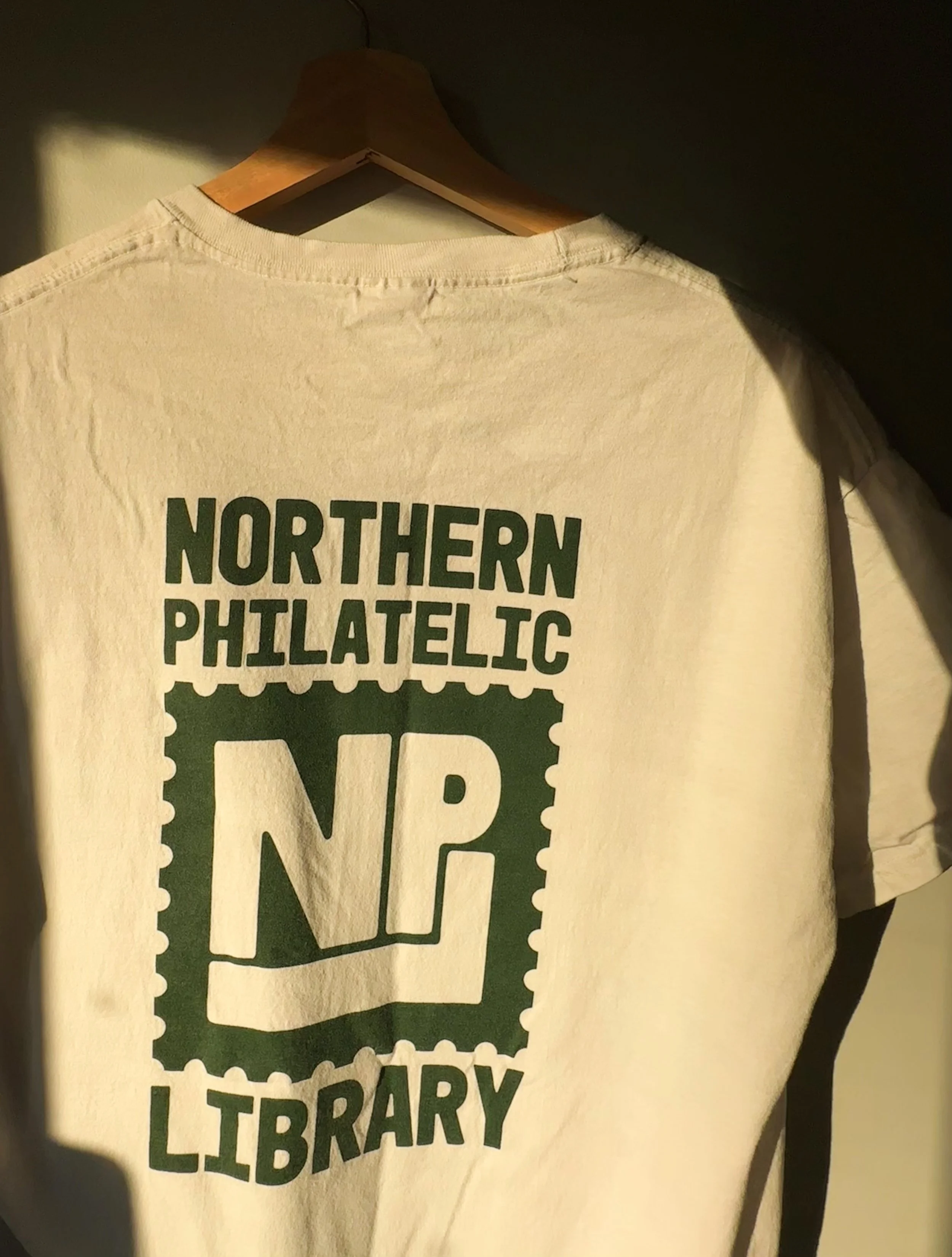
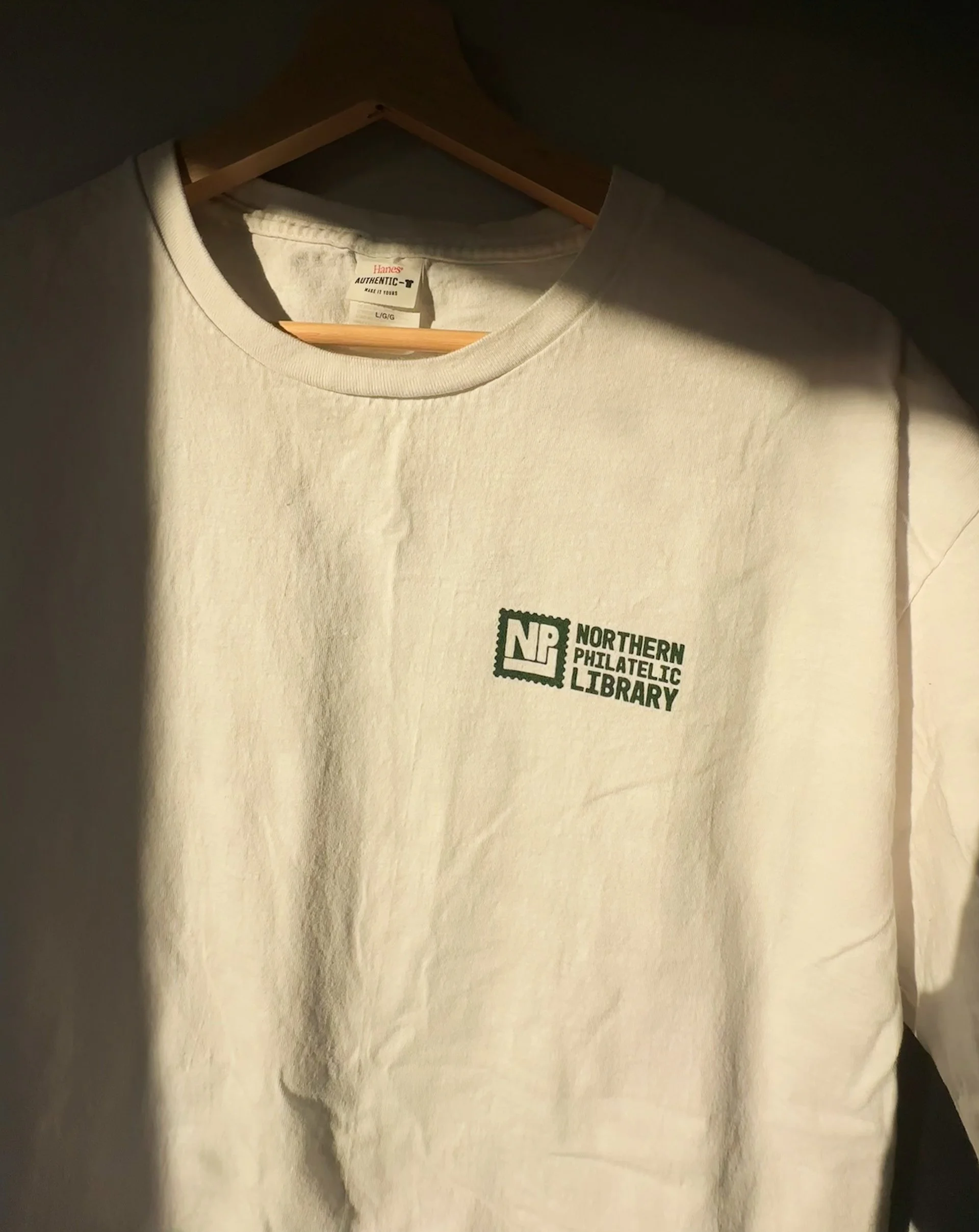
Once the logo and the designs were approved and finalized, we then ordered shirts for the members of the library. We designed and ordered through Underground Printing in Minneapolis, MN.
These shirts will be used to advertise and represent the library when members attend local and national philatelic events and expos.