Chisago Lakes Pride 2026
Role: Lead Designer, Marketing Coordinator
Client: Chisago Lakes Pride
Scope: Logo Design, Branding, Marketing
Chisago Lakes, MN is located about 40 miles North of the Twin Cities. It is a small town with lovely charm and local culture.
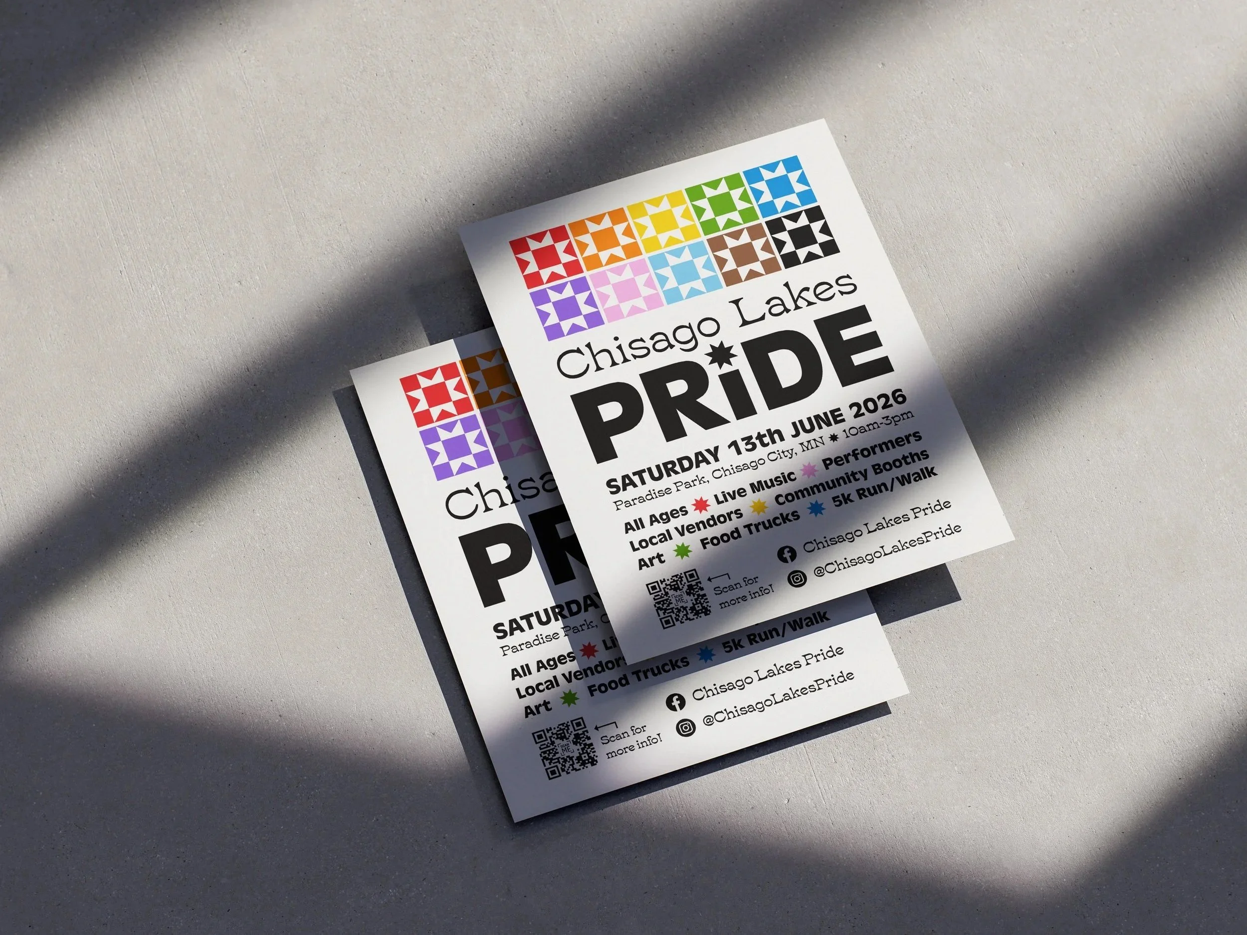
I had the opportunity to volunteer with Chisago Lakes Pride and design their new logo and branding for their event on June 13th, 2026. It is the third annual celebration and will include live music, a 5k, local vendors and artists, food trucks, and more. As a designer, it is always a dream to create designs that will be used for something meaningful, and this project was exactly that.
Challenge:
Develop a unifying brand identity that blends both LGBTQ+ Pride with local Chisago Lakes culture - a design that is unifying in both appearance and purpose. This logo had to be done within 3 weeks to get social media and various documents updated for the campaign for the June 13th, 2026 celebration day.
Once the logo is complete, the next step is creating various marketing and branding materials to continue promoting the event.
Solution:
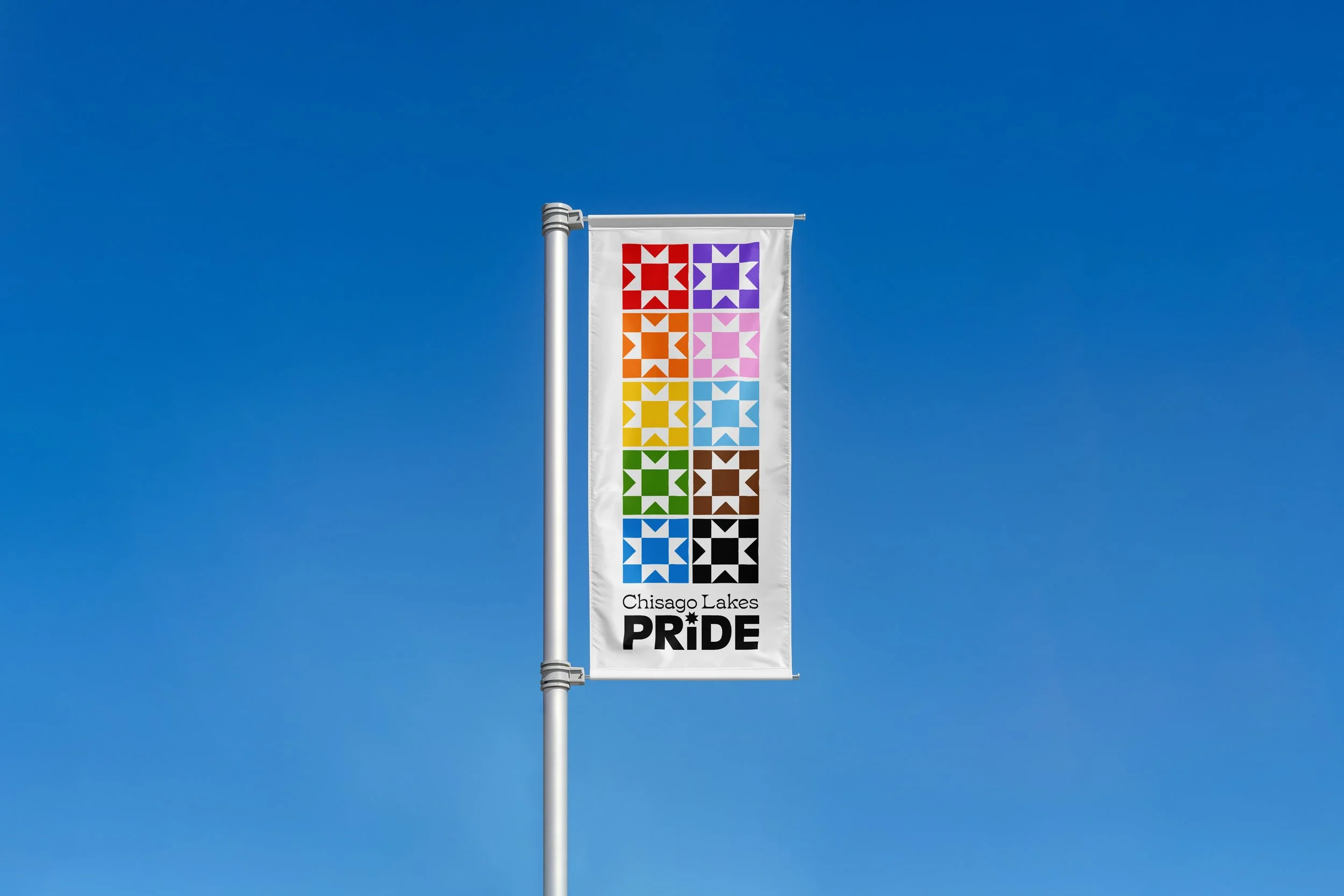
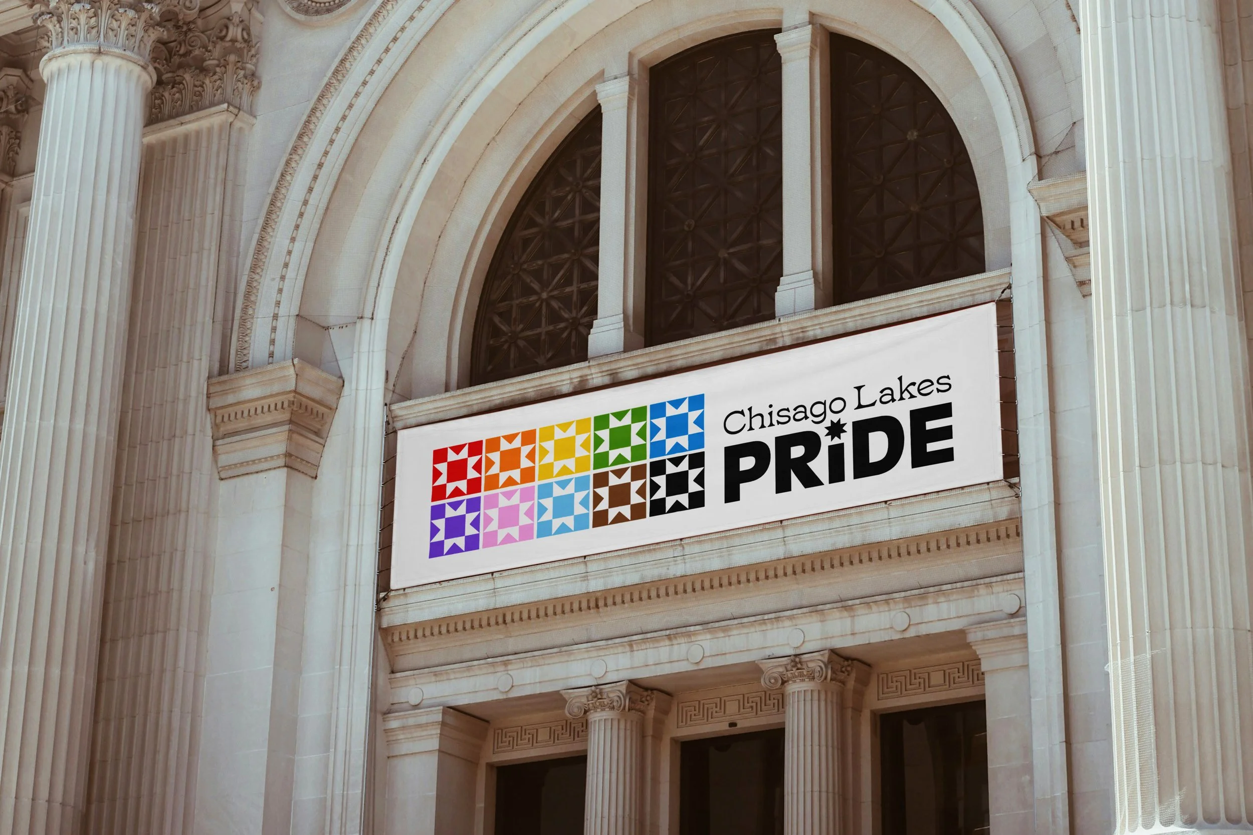
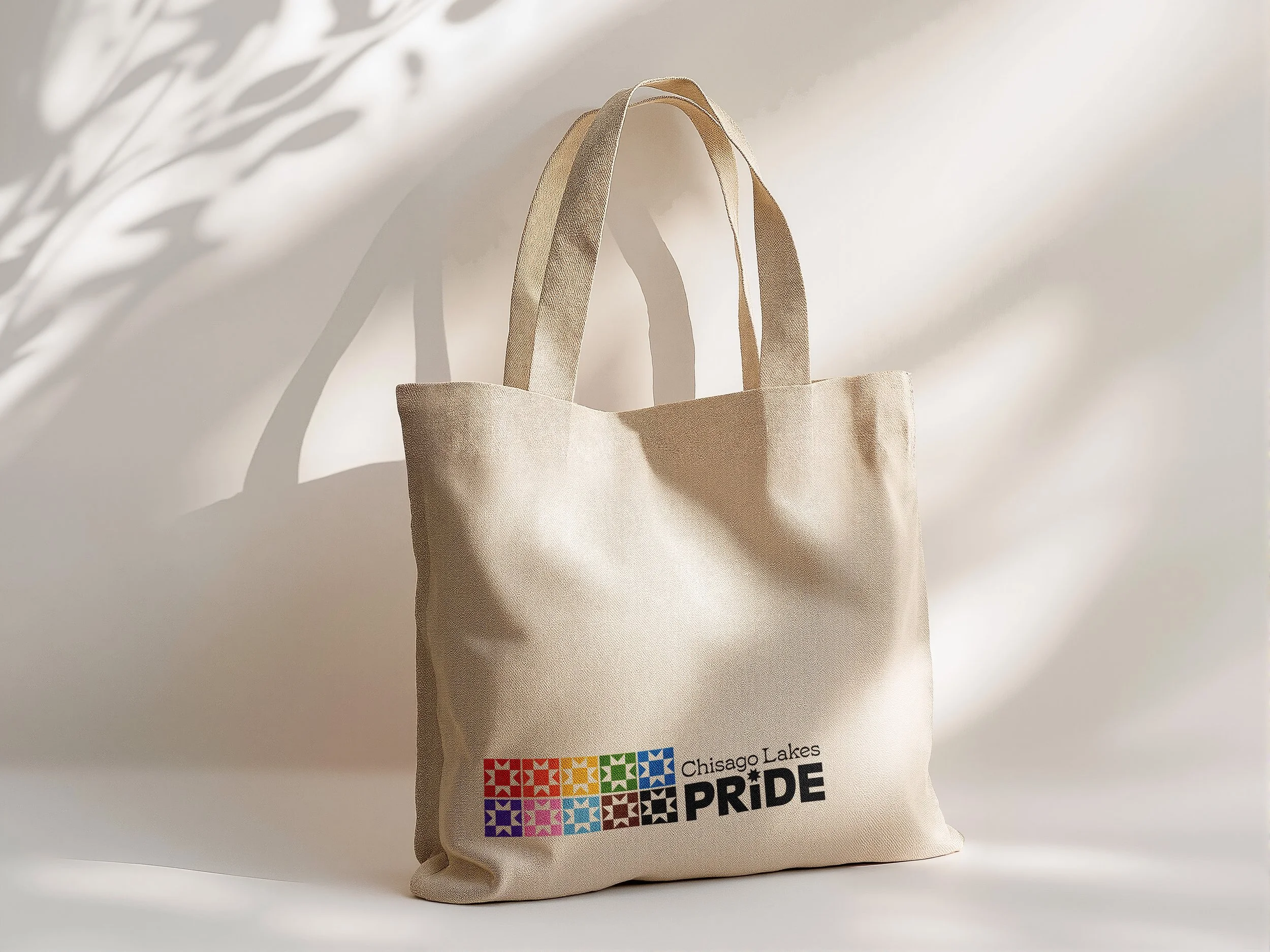
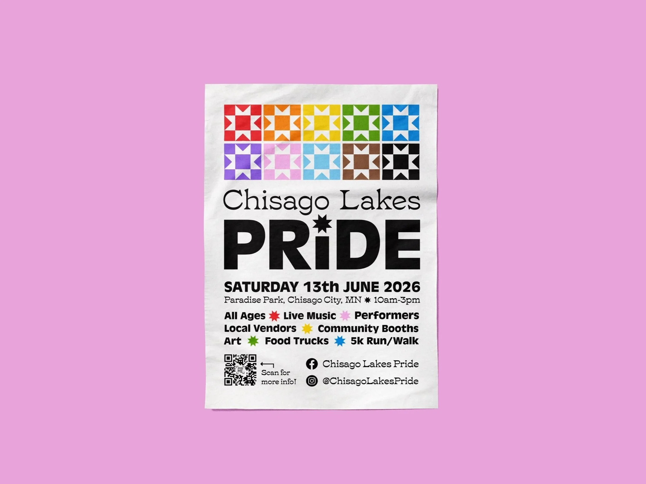
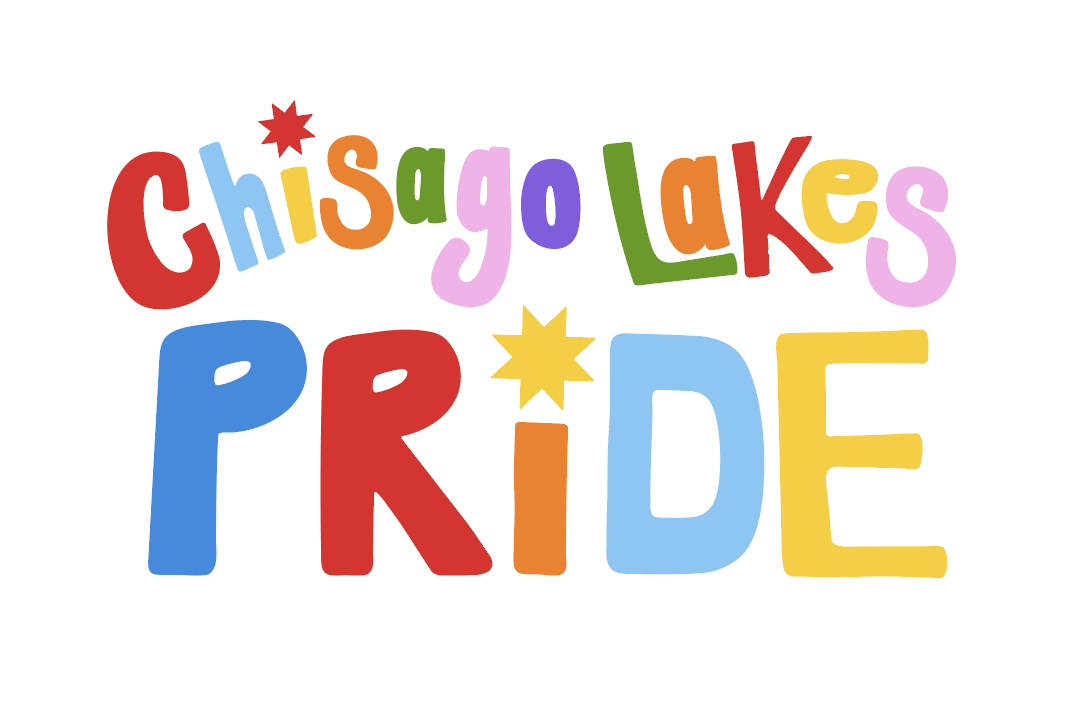
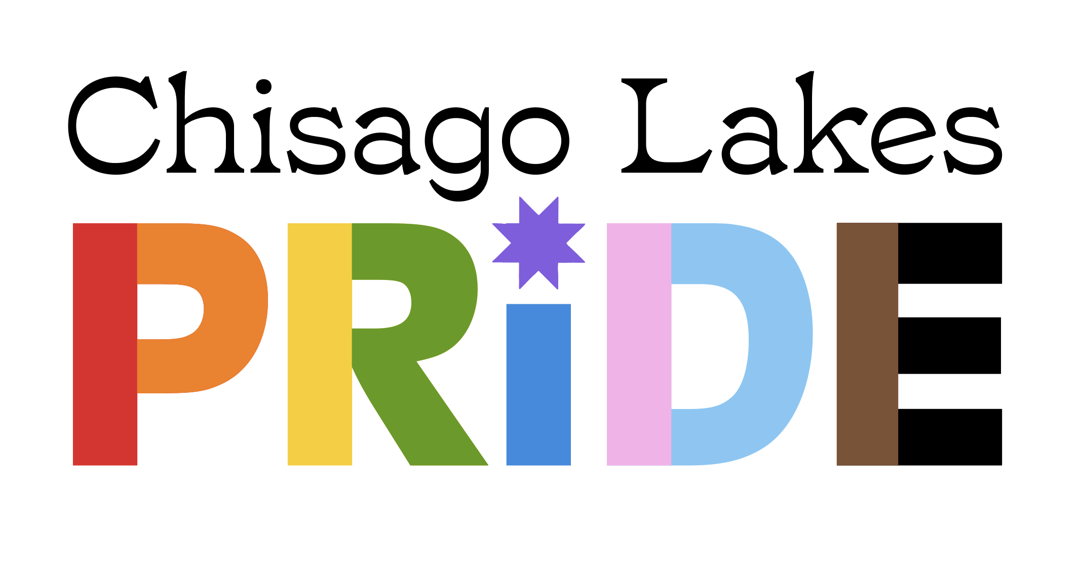
I designed a new logo that blends LGBTQ+ Progress Pride colors and local Swedish quilt design shapes to create a unifying logo. I met the timeline and created supporting marketing materials. As June 13, 2026 approaches, more marketing collateral and designs will be implemented in the campaign.
Logo Process
PREVIOUS Brand Identity
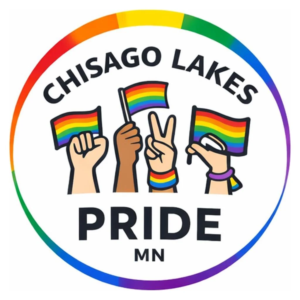
The previous logo was clear in messaging: it is a Pride group in Chisago Lakes, MN. However, the visual identity was missing a connection: a unique visual connection between both LGBTQ+ Pride and the Chisago Lakes area.
Sketches / Explorations
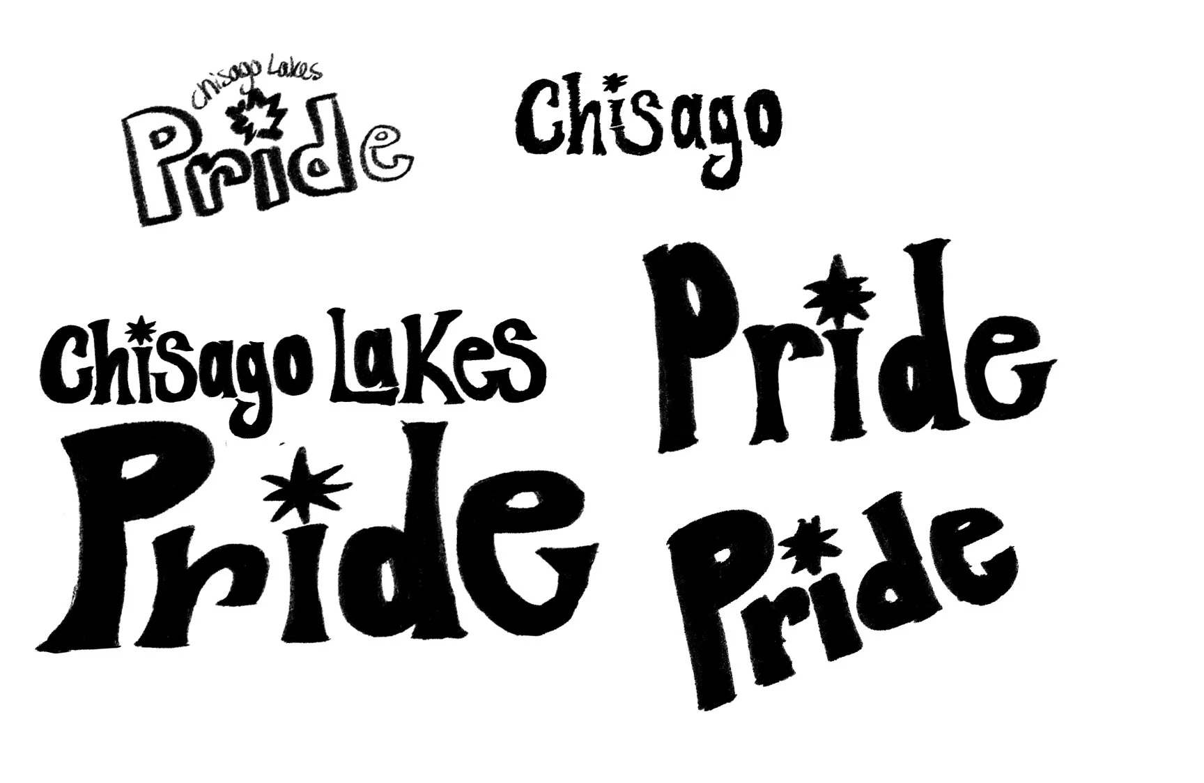
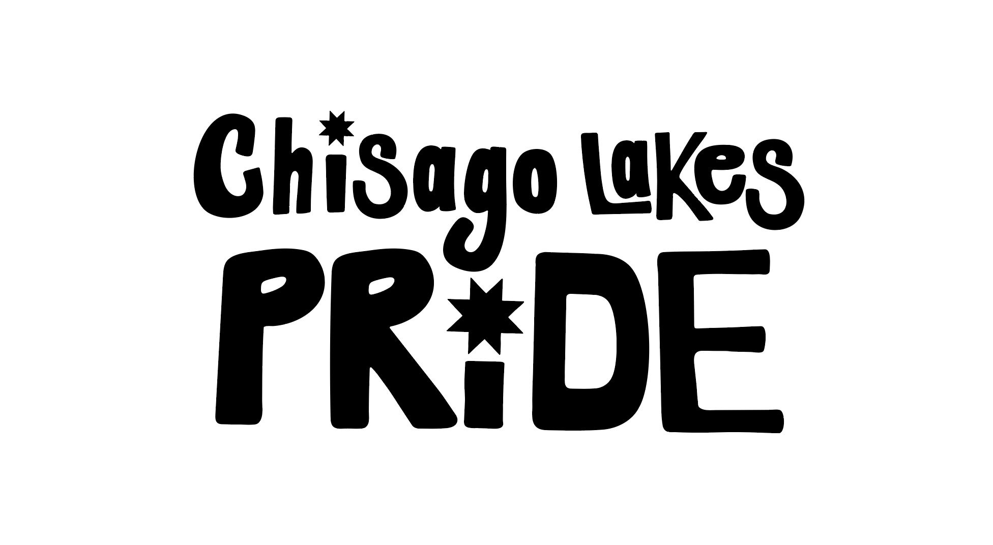
Idea 1: Hand-drawn logotype

My initial idea was to have a hand-drawn logotype that had a welcoming and fun energy to it. I liked how playful this logo was, but it almost felt too adolescent. I wanted something playful, but something that would also cater to all ages.
I knew this design had potential, so I set it aside to potentially use for posters, stickers, or other designs for the event.
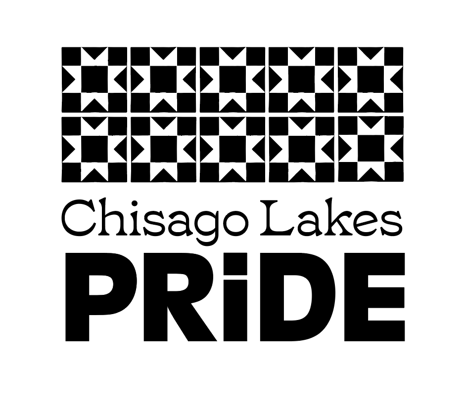
Idea 2: Swedish quilt inspired logo
The inspiration
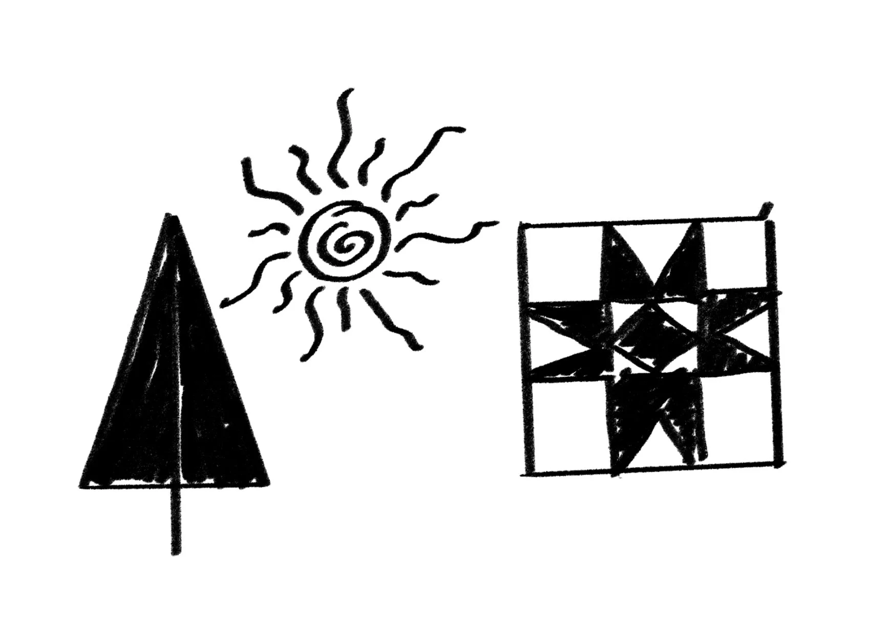
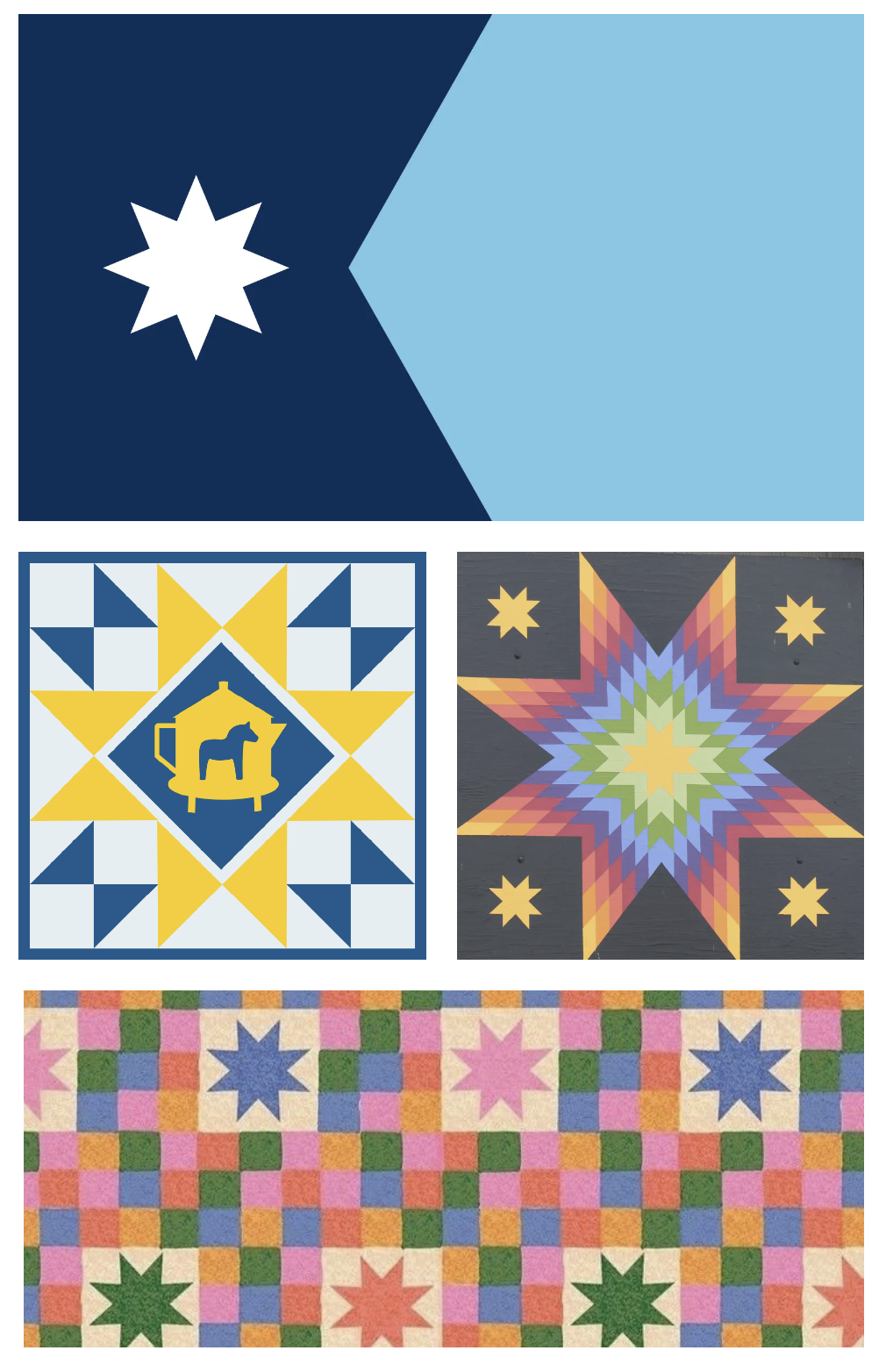
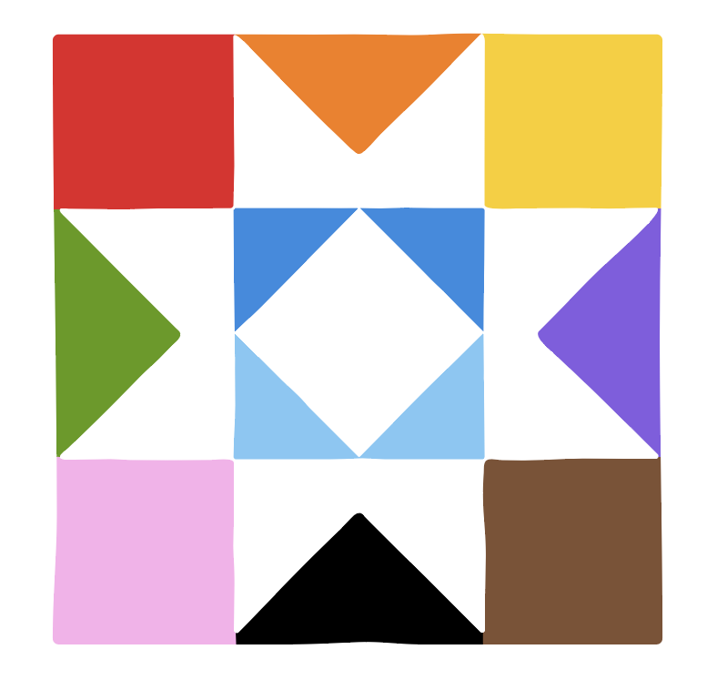
For the logo, I was initially inspired by the star in the Minnesota state flag. I loved the idea of tying the logo to our state; and seeing how I could incorporate it into the logo / brand design.
Then, I was reminded of the Swedish barn quilts in the Chisago Lakes Barn Quilt Trail (more info). I then began exploring.
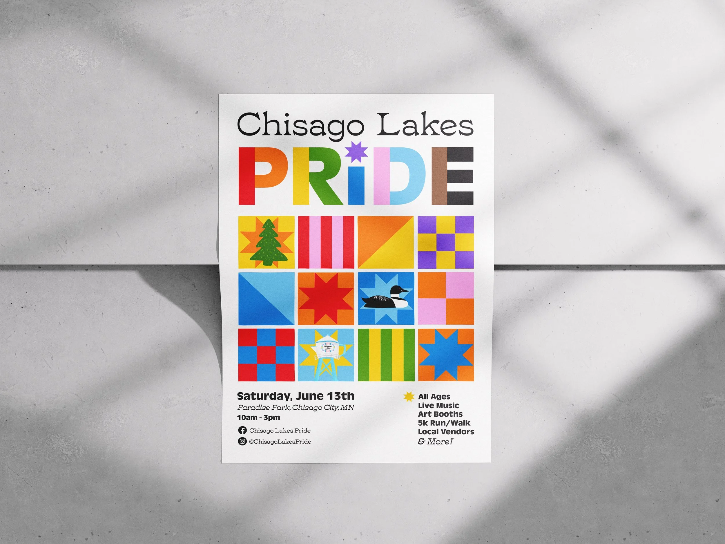
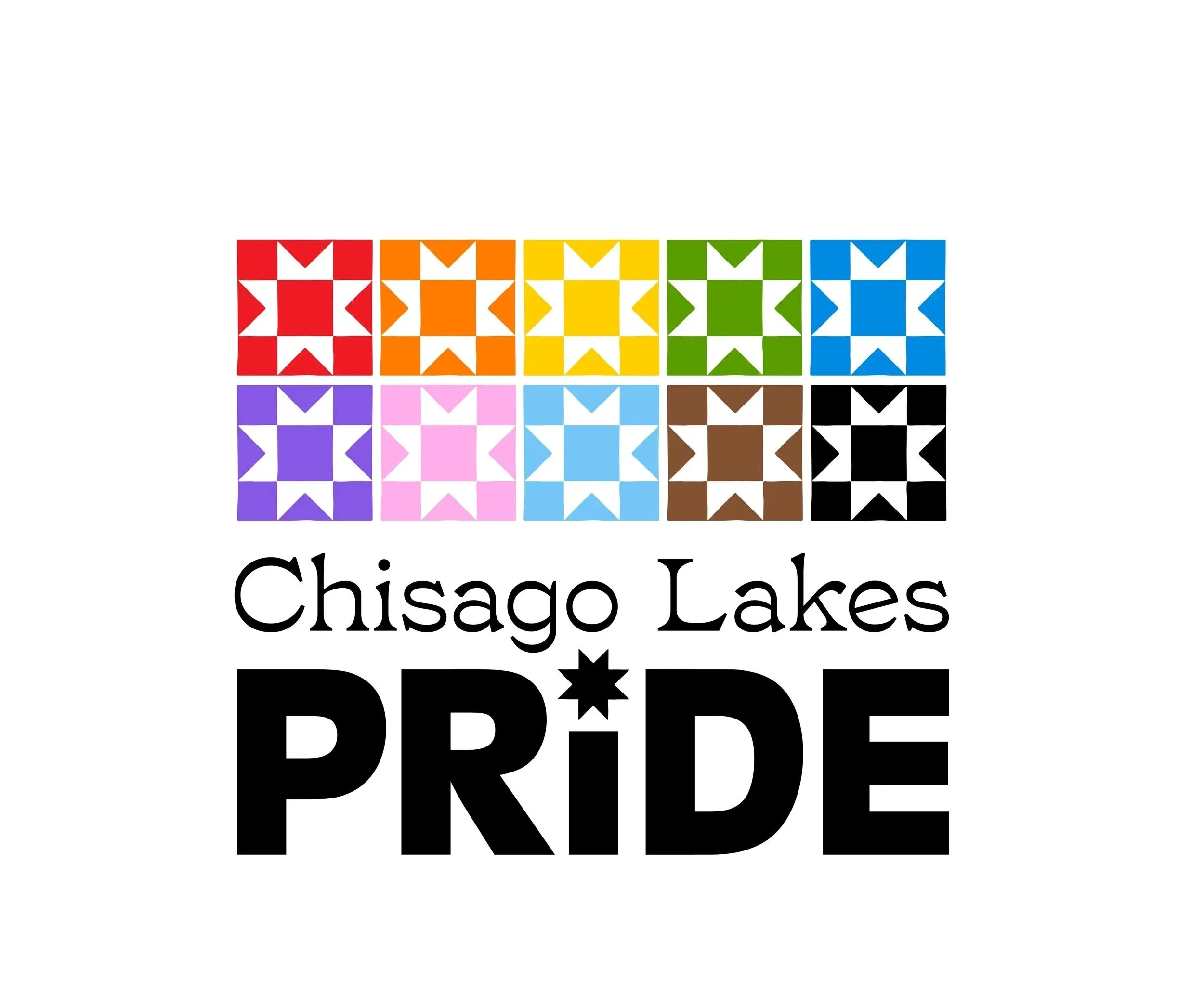
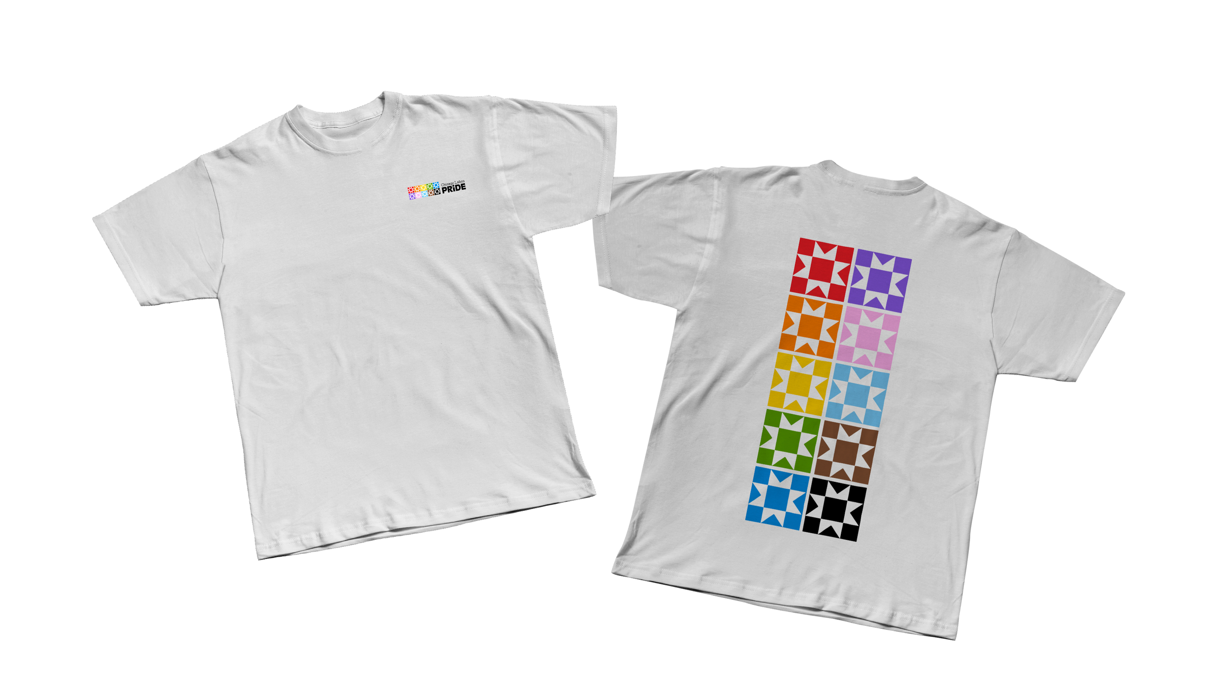
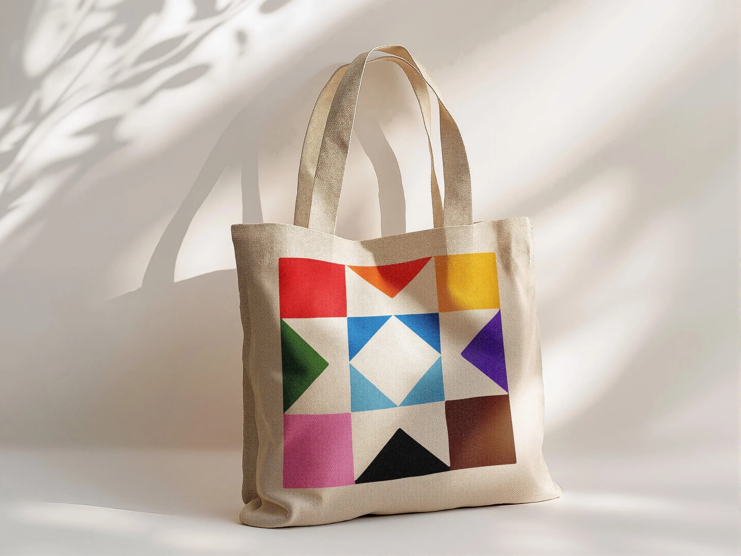
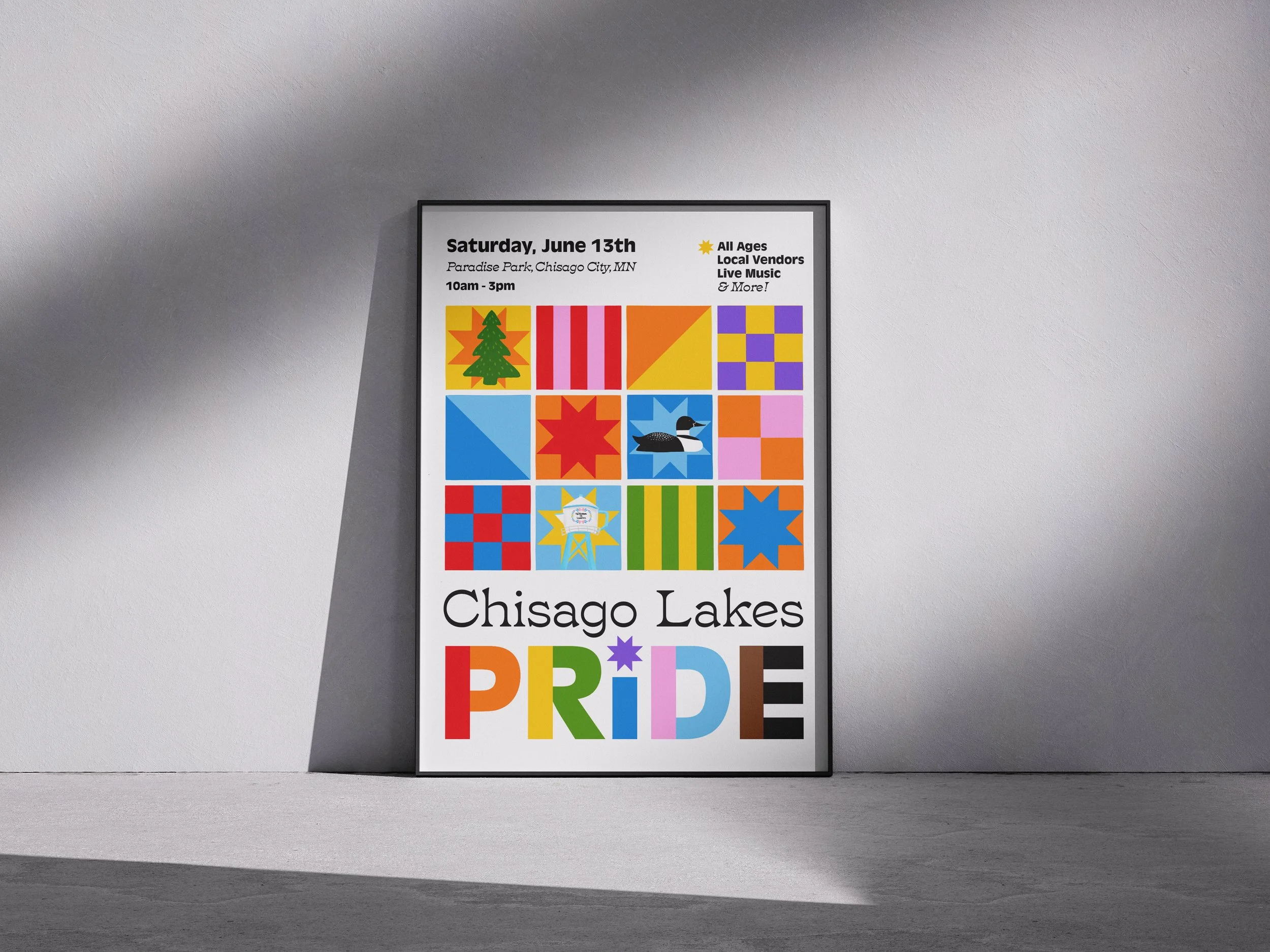
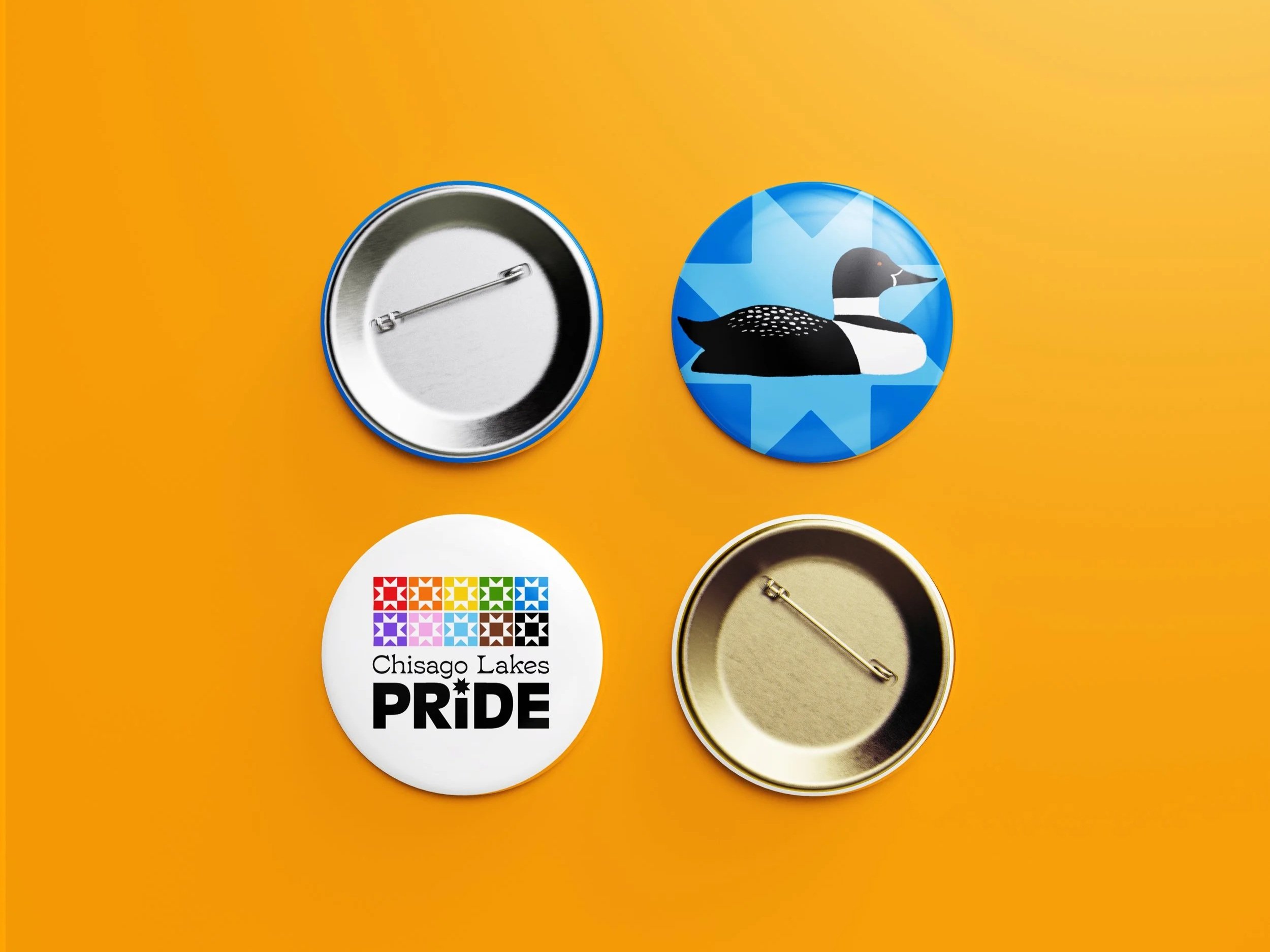
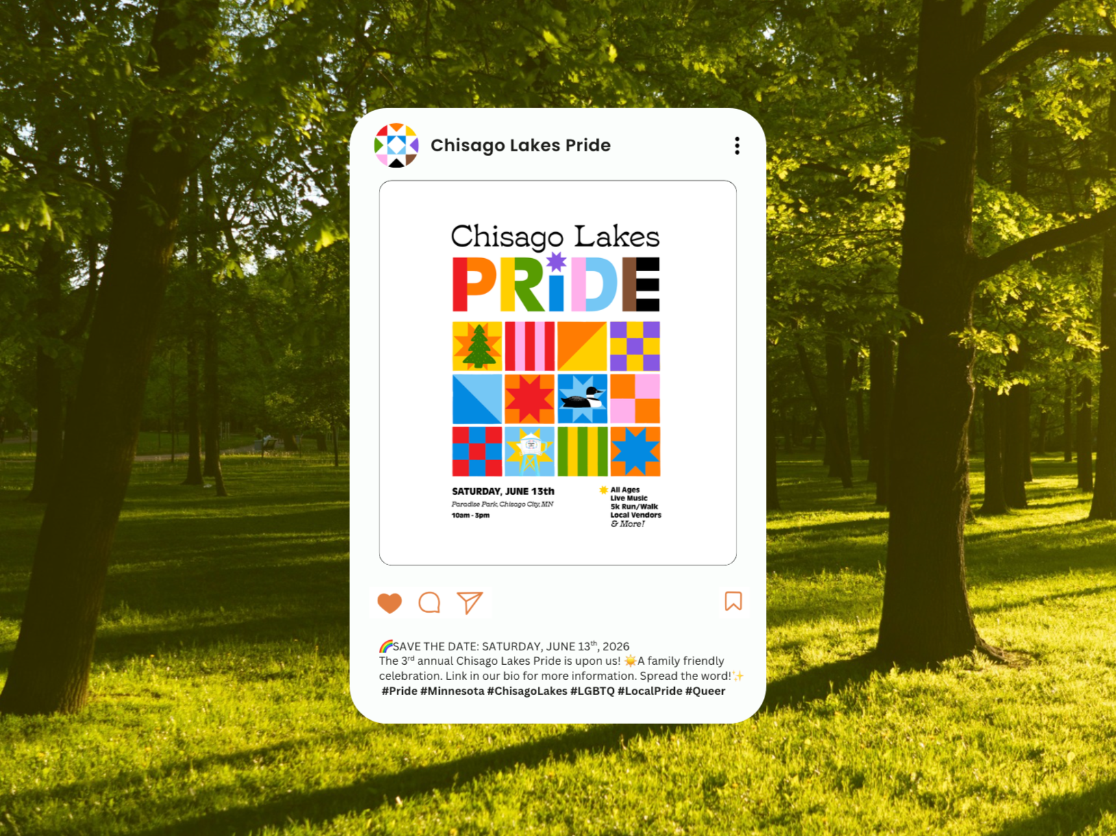
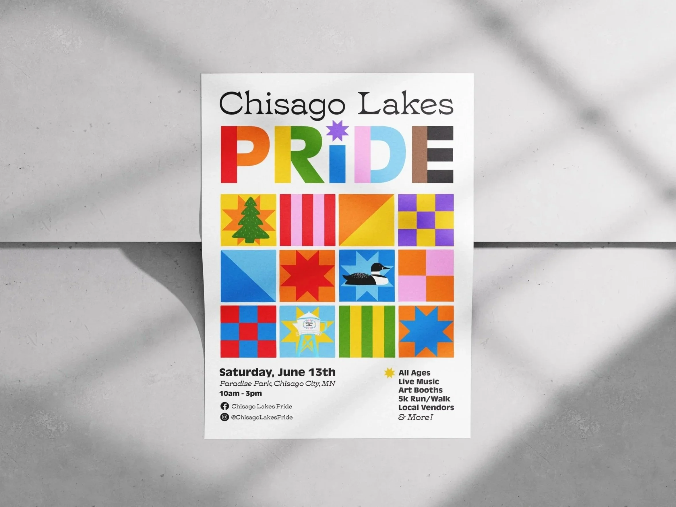
I loved this tie to community, and I thought the logo itself could be a quilt of the progress Pride colors and also use the star/quilt shape in the letter I of PRIDE. The quilt shapes themselves are hand-drawn shapes, to give it that personable and human feel while also being unified.
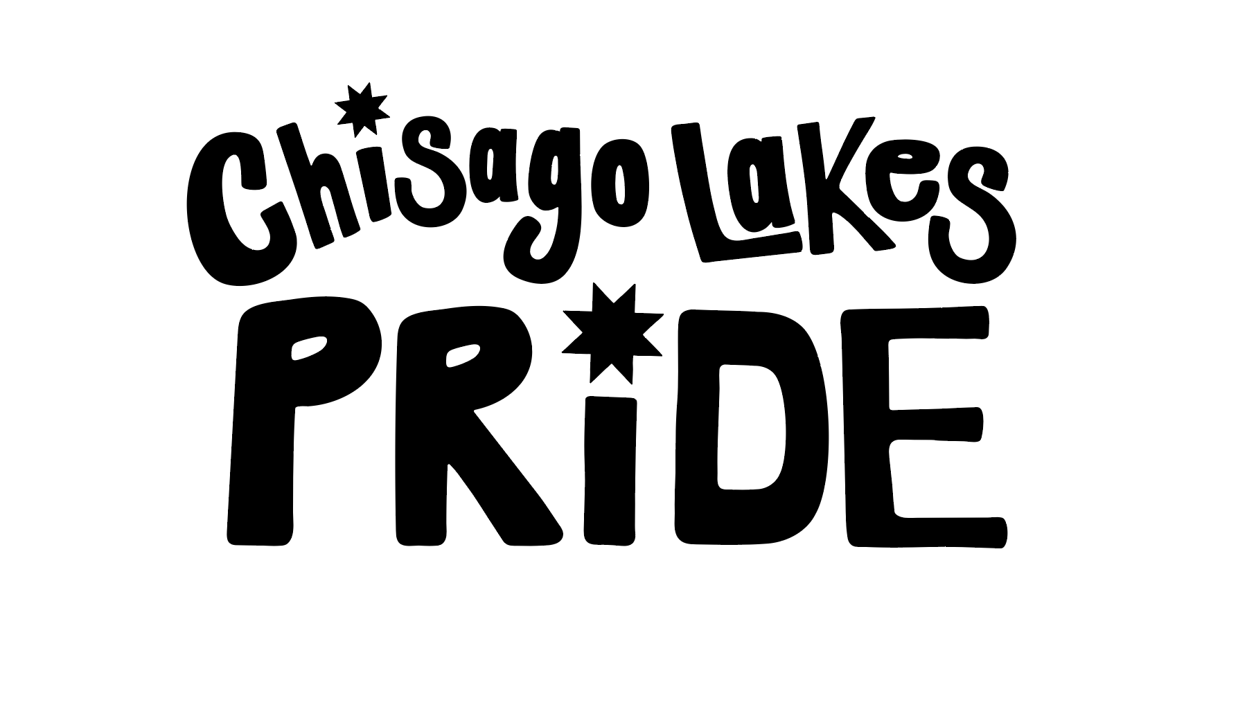
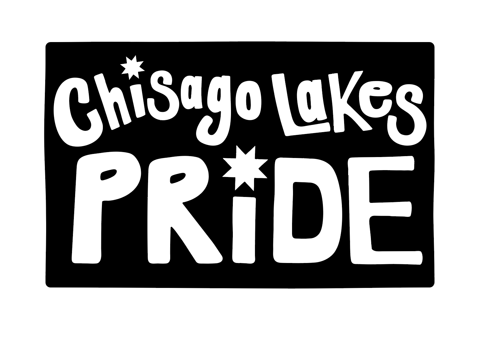
Final Design
I designed a third variation of the logo that was just a logotype, but still included the progress Pride colors. I wanted a version of the logo without the quilt to pair it with other design elements and illustrations.
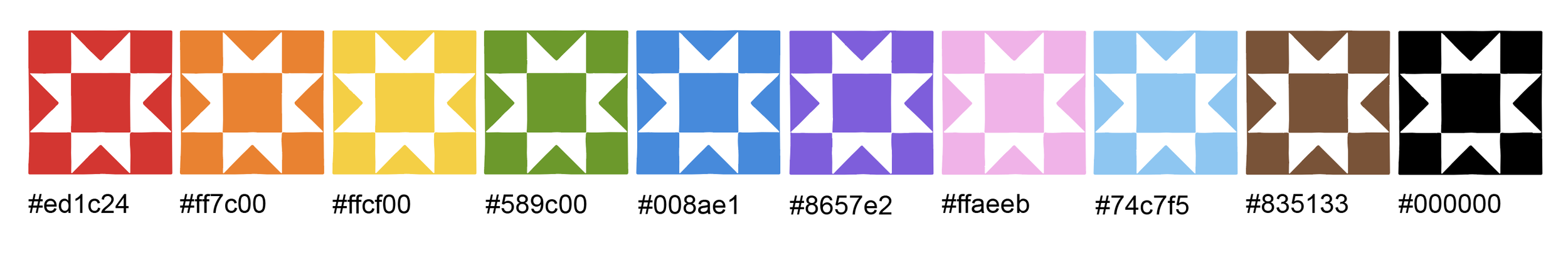
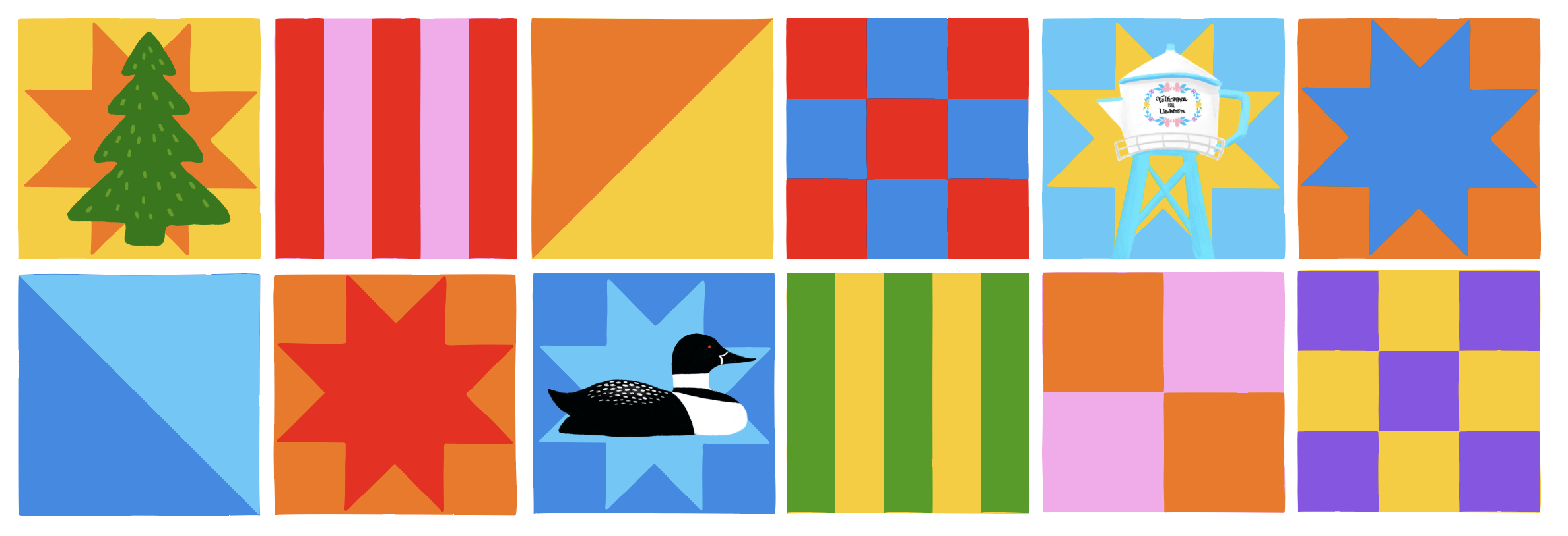
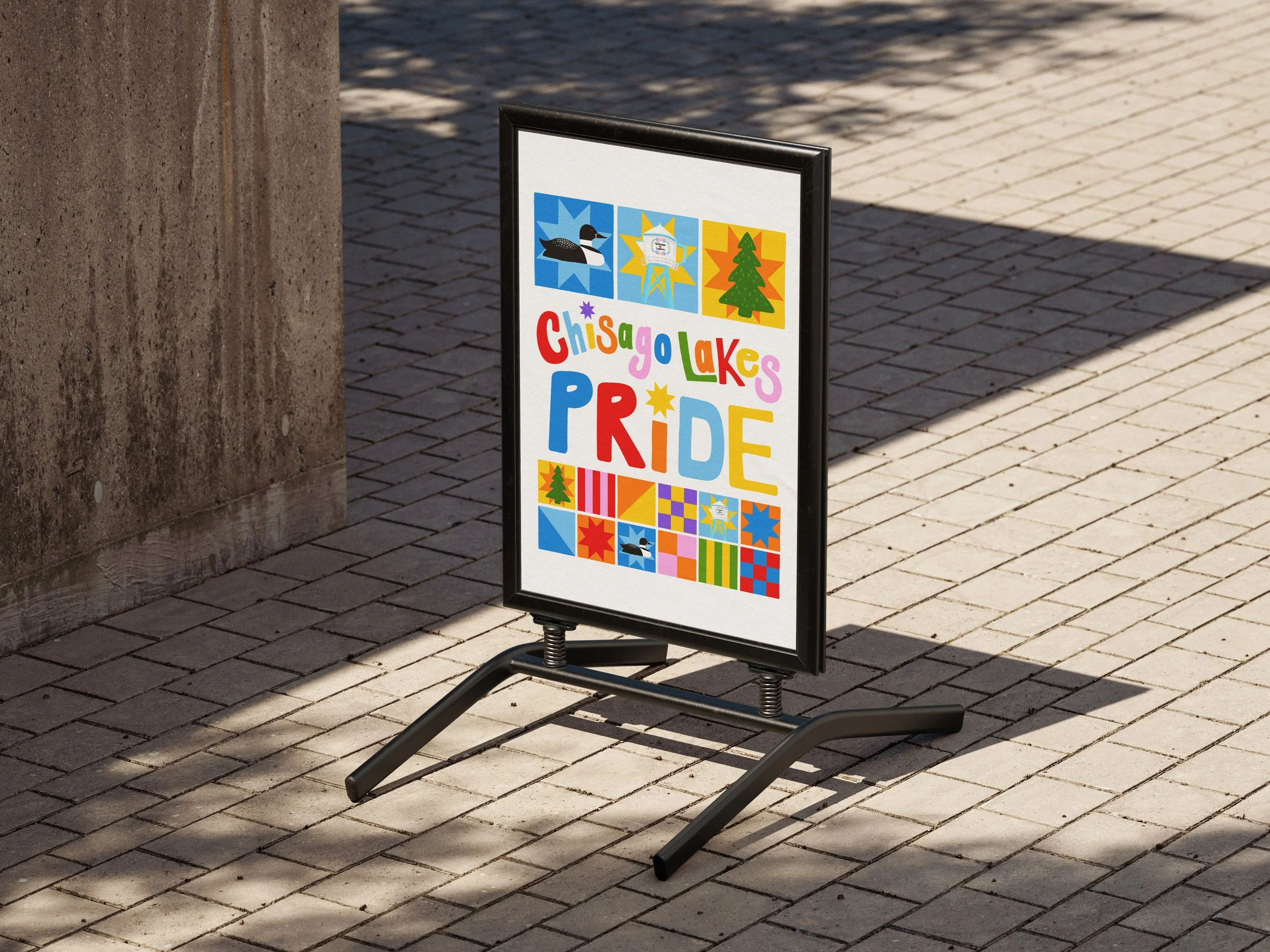
To bring more charm into the brand identity, I created more quilt patterns, color pairings, and illustrated local subjects. One of the illustrations includes Lindstrom’s iconic coffee pot water tower, a loon, and a tree illustration.
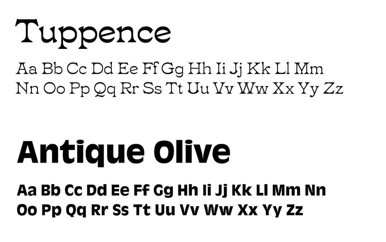
These are hand-drawn elements with a bit more texture layered on top of the quilt designs to give it a personable feel. This brings more personality to the branding on various collateral for the event such as posters, social media posts, banners, and more. It makes it more integrated into the local culture while also creating an individual brand identity.